建立 Flutter 版面配置
學習如何在 Flutter 中建立版面配置。
本教學將說明如何在 Flutter 中設計與建立版面配置。
如果你使用提供的範例程式碼,將可以建立下列應用程式。
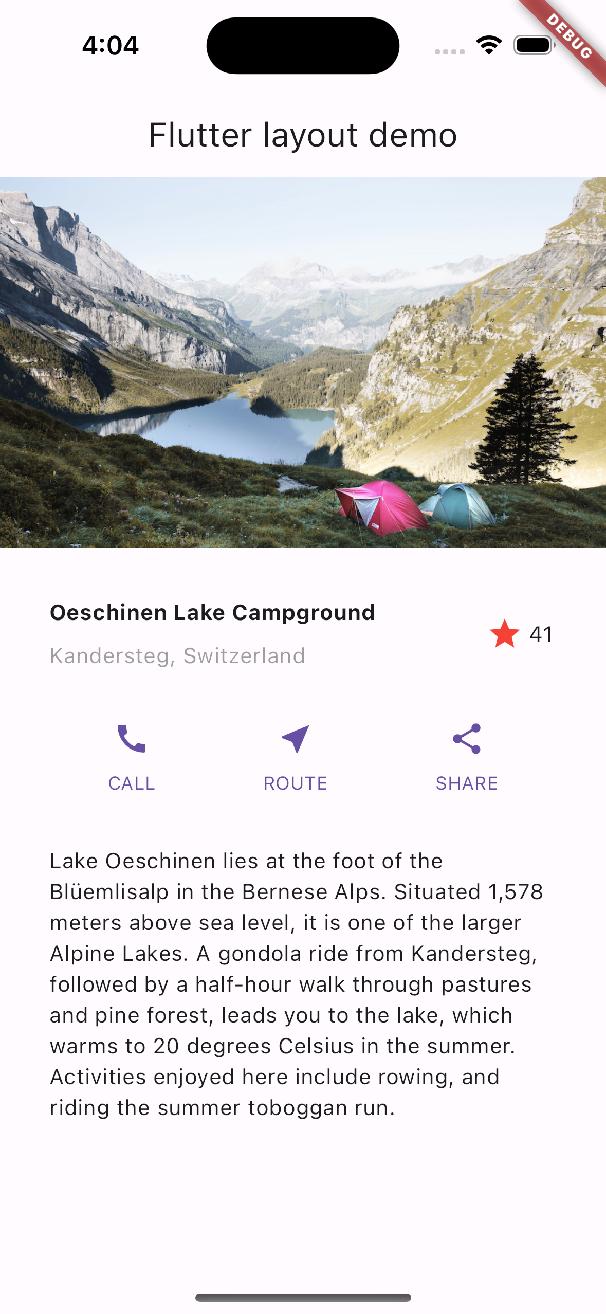
完成的應用程式畫面。
照片來源:Dino Reichmuth,取自 Unsplash。 文字來源:Switzerland Tourism。
若想更全面了解版面配置機制,請先參考 Flutter 的版面配置方法。
繪製版面配置圖
#在本節中,請思考你希望為應用程式使用者帶來什麼樣的體驗。
考慮如何擺放使用者介面的各個元件。 一個版面配置就是這些擺放結果的總和。 事先規劃版面配置可以加快你的開發速度。 利用視覺提示來判斷元素在螢幕上的位置會非常有幫助。
你可以選擇自己喜歡的方法,例如介面設計工具,或是用鉛筆和紙。 在撰寫程式碼前,先決定好螢幕上要放置哪些元素及其位置。 這就像程式開發版的那句老話: 「量兩次,剪一次。」
請自問以下問題,將版面配置拆解為基本元素:
- 你能辨識出有哪些列(row)與欄(column)嗎?
- 這個版面配置是否包含格線(grid)?
- 有重疊的元素嗎?
- UI 是否需要分頁標籤(tabs)?
- 哪些元素需要對齊、填充(pad)或加上邊框?
先辨認較大的元素。在本範例中,你會將圖片、標題、按鈕和描述依序排列成一個欄(column)。

版面配置中的主要元素:圖片、列、列,以及文字區塊
為每一列繪製圖示。
第 1 列,也就是 標題 區塊,有三個子元素: 一個文字欄(column)、一個星形圖示,以及一個數字。 第一個子元素(欄)包含兩行文字。 這個欄可能需要較多空間。

含有文字區塊與圖示的標題區塊
第 2 列,也就是 按鈕區塊,有三個子元素:每個子元素都包含一個欄,欄內再包含一個圖示和一段文字。

含有三個標籤按鈕的按鈕區塊
在繪製完版面配置圖後,請思考你會如何撰寫程式碼。
你會將所有程式碼寫在同一個類別中嗎? 還是會為版面配置的每個部分建立一個類別?
為了遵循 Flutter 的最佳實踐,請為版面配置的每個部分建立一個類別或元件(Widget)。
當 Flutter 需要重新繪製 UI 的某個部分時,只會更新有變動的最小區塊。
這也是為什麼 Flutter 採用「萬物皆元件(Widget)」的設計理念。
如果只有 Text 元件中的文字變動,Flutter 只會重繪那段文字。
Flutter 會根據使用者輸入,只改變 UI 中最少的部分。
在本教學中,請將你辨識出的每個元素都寫成獨立的元件(Widget)。
建立應用程式的基礎程式碼
#在本節中,請先建立 Flutter 應用程式的基本程式碼架構。
-
將
lib/main.dart的內容替換為下列程式碼。 這個應用程式會將 app 標題與顯示於appBar的標題作為參數,這樣可以讓程式碼更簡潔。dartimport 'package:flutter/material.dart'; void main() => runApp(const MyApp()); class MyApp extends StatelessWidget { const MyApp({super.key}); @override Widget build(BuildContext context) { const String appTitle = 'Flutter layout demo'; return MaterialApp( title: appTitle, home: Scaffold( appBar: AppBar(title: const Text(appTitle)), body: const Center( child: Text('Hello World'), ), ), ); } }
新增標題區塊
#在本節中,建立一個 TitleSection 元件(Widget),其版面配置如下圖所示。

標題區塊的草圖與原型 UI
新增 TitleSection 元件(Widget)
#
請將以下程式碼加入在 MyApp 類別之後。
class TitleSection extends StatelessWidget {
const TitleSection({super.key, required this.name, required this.location});
final String name;
final String location;
@override
Widget build(BuildContext context) {
return Padding(
padding: const EdgeInsets.all(32),
child: Row(
children: [
Expanded(
/*1*/
child: Column(
crossAxisAlignment: CrossAxisAlignment.start,
children: [
/*2*/
Padding(
padding: const EdgeInsets.only(bottom: 8),
child: Text(
name,
style: const TextStyle(fontWeight: FontWeight.bold),
),
),
Text(location, style: TextStyle(color: Colors.grey[500])),
],
),
),
/*3*/
Icon(Icons.star, color: Colors.red[500]),
const Text('41'),
],
),
);
}
}
-
若要在橫列中使用所有剩餘的可用空間,請使用
Expanded元件(Widget)來拉伸Column元件。 若要將該 column(欄)放在橫列的起始位置,請將crossAxisAlignment屬性設為CrossAxisAlignment.start。 - 若要在多行文字之間加入間距,請將這些行包在
Padding元件中。 -
標題列最後會有一個紅色星號圖示,並顯示文字
41。 整個橫列包含在Padding元件中,並在每個邊緣加上 32 像素的內距(padding)。
將 app body 改為可滾動檢視
#
在 body 屬性中,將 Center 元件替換為 SingleChildScrollView 元件。
在 SingleChildScrollView
元件內,將 Text 元件替換為 Column 元件。
body: const Center(
  child: Text('Hello World'),
body: const SingleChildScrollView(
  child: Column(
    children: [
這些程式碼更新會以以下方式改變應用程式:
-
SingleChildScrollView元件可以滾動。 這讓不適合目前螢幕的元素也能顯示出來。 -
Column元件會依照其children屬性中列出的順序, 顯示所有元素。 在children清單中列出的第一個元素會顯示在 清單的最上方。children清單中的元素會按照陣列順序, 從上到下依序顯示在螢幕上。
更新應用程式以顯示標題區塊
#
將 TitleSection 元件加入為 children 清單的第一個元素。
這會讓它顯示在螢幕的最上方。
將提供的名稱和位置傳遞給 TitleSection 建構子。
children: [
  TitleSection(
    name: 'Oeschinen Lake Campground',
    location: 'Kandersteg, Switzerland',
  ),
],
新增按鈕區塊(Button section)
#在本節中,將新增按鈕來為你的應用程式加入功能。
按鈕區塊(Button section) 包含三個欄位,每個欄位都使用相同的版面配置: 一個圖示位於一行文字上方。

按鈕區塊的草圖與原型 UI
請規劃將這三個欄位平均分配在同一列中,讓每個欄位佔用相同的空間。所有文字與圖示皆使用主色(primary color)繪製。
新增 ButtonSection 元件(Widget)
#
請在 TitleSection 元件(Widget)之後加入以下程式碼,以建立包含按鈕列的程式碼。
class ButtonSection extends StatelessWidget {
const ButtonSection({super.key});
@override
Widget build(BuildContext context) {
final Color color = Theme.of(context).primaryColor;
// ···
}
}
建立一個元件(Widget)來製作按鈕
#
由於每個欄位的程式碼都可以使用相同的語法,請建立一個名為 ButtonWithText 的元件(Widget)。
這個元件的建構函式會接收一個顏色、圖示資料,以及按鈕的標籤。
利用這些值,該元件會建立一個 Column,其子元件包含一個 Icon 和一個經過樣式化的 Text
元件(Widget)。
為了幫助分隔這些子元件,Padding 元件會將 Text 元件包裹在 Padding
元件中。
請將下列程式碼加入在 ButtonSection 類別之後。
class ButtonSection extends StatelessWidget {
const ButtonSection({super.key});
// ···
}
class ButtonWithText extends StatelessWidget {
const ButtonWithText({
super.key,
required this.color,
required this.icon,
required this.label,
});
final Color color;
final IconData icon;
final String label;
@override
Widget build(BuildContext context) {
return Column(
mainAxisSize: MainAxisSize.min,
mainAxisAlignment: MainAxisAlignment.center,
children: [
Icon(icon, color: color),
Padding(
padding: const EdgeInsets.only(top: 8),
child: Text(
label,
style: TextStyle(
fontSize: 12,
fontWeight: FontWeight.w400,
color: color,
),
),
),
],
);
}
}
使用 Row 元件(Widget)來排列按鈕
#
將以下程式碼加入到 ButtonSection 元件中。
- 新增三個
ButtonWithText元件的實例,每個按鈕各用一個。 - 傳遞該按鈕專屬的顏色、
Icon和文字。 -
使用
MainAxisAlignment.spaceEvenly值,沿著主軸(main axis)對齊這些欄位(columns)。 對於Row元件,主軸是水平方向;而對於Column元件,主軸則是垂直方向。 因此,這個值會告訴 Flutter 沿著Row,在每個欄位的前方、之間和後方,平均分配剩餘空間。
class ButtonSection extends StatelessWidget {
const ButtonSection({super.key});
@override
Widget build(BuildContext context) {
final Color color = Theme.of(context).primaryColor;
return SizedBox(
child: Row(
mainAxisAlignment: MainAxisAlignment.spaceEvenly,
children: [
ButtonWithText(color: color, icon: Icons.call, label: 'CALL'),
ButtonWithText(color: color, icon: Icons.near_me, label: 'ROUTE'),
ButtonWithText(color: color, icon: Icons.share, label: 'SHARE'),
],
),
);
}
}
class ButtonWithText extends StatelessWidget {
const ButtonWithText({
super.key,
required this.color,
required this.icon,
required this.label,
});
final Color color;
final IconData icon;
final String label;
@override
Widget build(BuildContext context) {
return Column(
// ···
);
}
}
更新應用程式以顯示按鈕區塊
#將按鈕區塊新增到 children 清單中。
  TitleSection(
    name: 'Oeschinen Lake Campground',
    location: 'Kandersteg, Switzerland',
  ),
  ButtonSection(),
],
新增文字區塊
#在本節中,將文字描述加入此應用程式。

文字區塊的草圖與原型 UI
新增 TextSection 元件(Widget)
#
請將下列程式碼作為獨立元件,新增在 ButtonSection 元件(Widget)之後。
class TextSection extends StatelessWidget {
const TextSection({super.key, required this.description});
final String description;
@override
Widget build(BuildContext context) {
return Padding(
padding: const EdgeInsets.all(32),
child: Text(description, softWrap: true),
);
}
}
將 softWrap 設定為
true 時,文字行會在單字邊界自動換行前,先填滿整個欄寬。
更新應用程式以顯示文字區塊
#
在 ButtonSection 之後,新增一個 TextSection 元件(Widget)作為子元件。
新增 TextSection 元件時,請將其 description 屬性設為地點描述的文字內容。
    location: 'Kandersteg, Switzerland',
  ),
  ButtonSection(),
  TextSection(
    description:
        'Lake Oeschinen lies at the foot of the Blüemlisalp in the '
        'Bernese Alps. Situated 1,578 meters above sea level, it '
        'is one of the larger Alpine Lakes. A gondola ride from '
        'Kandersteg, followed by a half-hour walk through pastures '
        'and pine forest, leads you to the lake, which warms to 20 '
        'degrees Celsius in the summer. Activities enjoyed here '
        'include rowing, and riding the summer toboggan run.',
  ),
],
新增圖片區塊
#在本節中,將圖片檔案加入以完成你的版面配置。
設定應用程式以使用提供的圖片
#要設定你的應用程式引用圖片,請修改其 pubspec.yaml 檔案。
在專案頂層建立一個
images目錄。-
下載
lake.jpg圖片並將其加入新建立的images目錄。 -
若要包含圖片,請在應用程式根目錄下的
pubspec.yaml檔案中新增一個assets標籤。 當你加入assets時,它會作為你程式碼可用圖片的指標集合。pubspec.yamlyamlflutter: uses-material-design: true assets: - images/lake.jpg
建立 ImageSection 元件(Widget)
#
請在其他宣告之後,定義下列 ImageSection 元件(Widget)。
class ImageSection extends StatelessWidget {
const ImageSection({super.key, required this.image});
final String image;
@override
Widget build(BuildContext context) {
return Image.asset(image, width: 600, height: 240, fit: BoxFit.cover);
}
}
BoxFit.cover 值告訴 Flutter 以兩個限制條件來顯示圖片。首先,將圖片顯示得盡可能小。其次,覆蓋所有由版面配置分配的空間,這個空間稱為 render box(渲染框)。
更新應用程式以顯示圖片區塊
#
在 children 清單中,新增一個 ImageSection 元件作為第一個子元件。
將 image 屬性設為你在
設定應用程式以使用提供的圖片 中新增的圖片路徑。
children: [
  ImageSection(
    image: 'images/lake.jpg',
  ),
  TitleSection(
    name: 'Oeschinen Lake Campground',
    location: 'Kandersteg, Switzerland',
恭喜你
#就是這樣!當你熱重載(hot reload)應用程式後,你的 App 應該會長這樣。
完成的應用程式
資源
#你可以從以下位置取得本教學中使用的資源:
Dart 程式碼: main.dart
圖片: ch-photo
Pubspec: pubspec.yaml
下一步
#若要為這個版面配置加入互動功能,請參考 互動性教學。
Unless stated otherwise, the documentation on this site reflects Flutter 3.44.0. Page last updated on 2026-06-14. View source or report an issue.