處理點擊事件
如何處理點擊與拖曳。
你不僅希望向使用者顯示資訊,更希望使用者能與你的應用程式互動。
使用 GestureDetector
元件 (Widget) 來回應基本操作,例如點擊(tap)與拖曳(drag)。
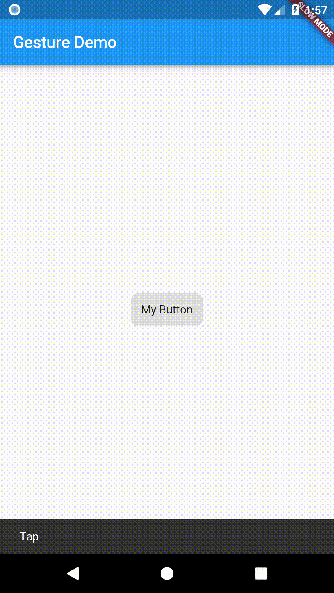
本教學將示範如何建立一個自訂按鈕,當被點擊時顯示 snackbar,步驟如下:
- 建立按鈕。
- 將其包裹在
GestureDetector中,並提供onTap()回呼(callback)。
dart
// The GestureDetector wraps the button.
GestureDetector(
// When the child is tapped, show a snackbar.
onTap: () {
const snackBar = SnackBar(content: Text('Tap'));
ScaffoldMessenger.of(context).showSnackBar(snackBar);
},
// The custom button
child: Container(
padding: const EdgeInsets.all(12),
decoration: BoxDecoration(
color: Colors.lightBlue,
borderRadius: BorderRadius.circular(8),
),
child: const Text('My Button'),
),
)
注意事項
#- 若需為你的按鈕加入 Material 漣漪(ripple)效果,請參閱 Add Material touch ripples 教學。
-
雖然本範例建立了一個自訂按鈕,Flutter 其實已內建多種按鈕實作,例如:
ElevatedButton、TextButton,以及CupertinoButton。
互動範例
#import 'package:flutter/material.dart';
void main() => runApp(const MyApp());
class MyApp extends StatelessWidget {
const MyApp({super.key});
@override
Widget build(BuildContext context) {
const title = 'Gesture Demo';
return const MaterialApp(
title: title,
home: MyHomePage(title: title),
);
}
}
class MyHomePage extends StatelessWidget {
final String title;
const MyHomePage({super.key, required this.title});
@override
Widget build(BuildContext context) {
return Scaffold(
appBar: AppBar(title: Text(title)),
body: const Center(child: MyButton()),
);
}
}
class MyButton extends StatelessWidget {
const MyButton({super.key});
@override
Widget build(BuildContext context) {
// The GestureDetector wraps the button.
return GestureDetector(
// When the child is tapped, show a snackbar.
onTap: () {
const snackBar = SnackBar(content: Text('Tap'));
ScaffoldMessenger.of(context).showSnackBar(snackBar);
},
// The custom button
child: Container(
padding: const EdgeInsets.all(12),
decoration: BoxDecoration(
color: Colors.lightBlue,
borderRadius: BorderRadius.circular(8),
),
child: const Text('My Button'),
),
);
}
}
Was this page's content helpful?
Unless stated otherwise, the documentation on this site reflects Flutter 3.44.0. Page last updated on 2026-06-14. View source or report an issue.