在螢幕中加入抽屜 (Drawer)
如何實作 Material Drawer。
在使用 Material Design 的應用程式中, 有兩種主要的導覽方式:分頁(tabs)與抽屜(drawers)。 當空間不足以支援分頁時, 抽屜就是一個很方便的替代方案。
在 Flutter 中,可以結合 Drawer
元件 (Widget) 與
Scaffold,來建立具有 Material Design 抽屜的版面配置。
本教學將依照以下步驟進行:
- 建立
Scaffold。 - 加入抽屜(drawer)。
- 在抽屜中加入項目。
- 以程式方式關閉抽屜。
1. 建立 Scaffold
#
要在應用程式中加入抽屜,請將其包裹在 Scaffold
元件中。
Scaffold 元件為遵循 Material Design 指南的應用程式
提供一致的視覺結構。
它同時支援特殊的 Material Design
元件,例如 Drawer、AppBar 以及 SnackBar。
在這個範例中,會建立一個帶有 drawer 的 Scaffold:
Scaffold(
  appBar: AppBar(title: const Text('AppBar without hamburger button')),
  drawer: // Add a Drawer here in the next step.
);
2. 新增抽屜 (Drawer)
#
現在,將抽屜 (Drawer) 加入 Scaffold。抽屜可以是任何元件,但通常建議使用 material library
中的 Drawer 元件,因為它遵循 Material Design 規範。
Scaffold(
  appBar: AppBar(title: const Text('AppBar with hamburger button')),
  drawer: Drawer(
    child: // Populate the Drawer in the next step.
  ),
);
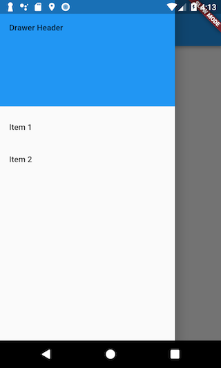
3. 在抽屜中加入項目
#
現在你已經有了 Drawer,接下來可以為其加入內容。
在這個範例中,請使用 ListView。
雖然你可以使用 Column 元件,
但 ListView 非常方便,因為當內容超過螢幕可顯示的範圍時,
它允許使用者在抽屜中進行捲動。
請在 ListView 中加入一個 DrawerHeader
以及兩個 ListTile
元件。
若需更多有關操作清單的資訊,
請參閱 list recipes。
Drawer(
  // Add a ListView to the drawer. This ensures the user can scroll
  // through the options in the drawer if there isn't enough vertical
  // space to fit everything.
  child: ListView(
    // Important: Remove any padding from the ListView.
    padding: EdgeInsets.zero,
    children: [
      const DrawerHeader(
        decoration: BoxDecoration(color: Colors.blue),
        child: Text('Drawer Header'),
      ),
      ListTile(
        title: const Text('Item 1'),
        onTap: () {
          // Update the state of the app.
          // ...
        },
      ),
      ListTile(
        title: const Text('Item 2'),
        onTap: () {
          // Update the state of the app.
          // ...
        },
      ),
    ],
  ),
);
4. 以程式方式開啟抽屜(drawer)
#
通常,你不需要撰寫任何程式碼來開啟 drawer,
因為當 leading 元件為 null 時,AppBar 的預設實作就是 DrawerButton。
但如果你想要更自由地控制 drawer,
可以透過 Builder 呼叫 Scaffold.of(context).openDrawer() 來達成。
Scaffold(
  appBar: AppBar(
    title: const Text('AppBar with hamburger button'),
    leading: Builder(
      builder: (context) {
        return IconButton(
          icon: const Icon(Icons.menu),
          onPressed: () {
            Scaffold.of(context).openDrawer();
          },
        );
      },
    ),
  ),
  drawer: Drawer(
    child: // Populate the Drawer in the last step.
  ),
);
5. 以程式方式關閉抽屜(drawer)
#
當使用者點擊某個項目後,你可能會希望自動關閉抽屜(drawer)。
你可以透過使用 Navigator
來達成。
當使用者開啟抽屜時,Flutter 會將該抽屜加入導覽堆疊(navigation stack)。
因此,若要關閉抽屜,只需呼叫 Navigator.pop(context) 即可。
ListTile(
  title: const Text('Item 1'),
  onTap: () {
    // Update the state of the app
    // ...
    // Then close the drawer
    Navigator.pop(context);
  },
),
互動範例
#
此範例展示了一個 Drawer,如同它在
Scaffold 元件中被使用的情境。
Drawer
內包含三個 ListTile
項目。
_onItemTapped 函式會變更被選取項目的索引,並在 Scaffold 的中央顯示對應的文字。
import 'package:flutter/material.dart';

void main() => runApp(const MyApp());

class MyApp extends StatelessWidget {
  const MyApp({super.key});

  static const appTitle = 'Drawer Demo';

  @override
  Widget build(BuildContext context) {
    return const MaterialApp(
      title: appTitle,
      home: MyHomePage(title: appTitle),
    );
  }
}

class MyHomePage extends StatefulWidget {
  const MyHomePage({super.key, required this.title});

  final String title;

  @override
  State<MyHomePage> createState() => _MyHomePageState();
}

class _MyHomePageState extends State<MyHomePage> {
  int _selectedIndex = 0;
  static const TextStyle optionStyle = TextStyle(
    fontSize: 30,
    fontWeight: FontWeight.bold,
  );
  static const List<Widget> _widgetOptions = <Widget>[
    Text('Index 0: Home', style: optionStyle),
    Text('Index 1: Business', style: optionStyle),
    Text('Index 2: School', style: optionStyle),
  ];

  void _onItemTapped(int index) {
    setState(() {
      _selectedIndex = index;
    });
  }

  @override
  Widget build(BuildContext context) {
    return Scaffold(
      appBar: AppBar(
        title: Text(widget.title),
        leading: Builder(
          builder: (context) {
            return IconButton(
              icon: const Icon(Icons.menu),
              onPressed: () {
                Scaffold.of(context).openDrawer();
              },
            );
          },
        ),
      ),
      body: Center(child: _widgetOptions[_selectedIndex]),
      drawer: Drawer(
        // Add a ListView to the drawer. This ensures the user can scroll
        // through the options in the drawer if there isn't enough vertical
        // space to fit everything.
        child: ListView(
          // Important: Remove any padding from the ListView.
          padding: EdgeInsets.zero,
          children: [
            const DrawerHeader(
              decoration: BoxDecoration(color: Colors.blue),
              child: Text('Drawer Header'),
            ),
            ListTile(
              title: const Text('Home'),
              selected: _selectedIndex == 0,
              onTap: () {
                // Update the state of the app
                _onItemTapped(0);
                // Then close the drawer
                Navigator.pop(context);
              },
            ),
            ListTile(
              title: const Text('Business'),
              selected: _selectedIndex == 1,
              onTap: () {
                // Update the state of the app
                _onItemTapped(1);
                // Then close the drawer
                Navigator.pop(context);
              },
            ),
            ListTile(
              title: const Text('School'),
              selected: _selectedIndex == 2,
              onTap: () {
                // Update the state of the app
                _onItemTapped(2);
                // Then close the drawer
                Navigator.pop(context);
              },
            ),
          ],
        ),
      ),
    );
  }
}
Unless stated otherwise, the documentation on this site reflects Flutter 3.44.0. Page last updated on 2026-06-14. View source or report an issue.