理解 constraints(約束條件)
Flutter 的元件(Widget)constraints(約束條件)、尺寸、定位及其互動方式模型說明。
當學習 Flutter 的人問你,為什麼某個帶有 width: 100 的元件 (Widget) 不是 100 像素寬時,預設的答案通常是建議他們把該元件包在 Center
裡,對吧?
請不要這麼做。
如果你這麼做,他們會一次又一次地回來問你,為什麼某個 FittedBox 沒有效果、為什麼那個 Column 溢出了,或者 IntrinsicWidth
應該要做什麼。
你應該先告訴他們,Flutter 的版面配置(layout)和 HTML 版面配置非常不同(他們很可能是從 HTML 來的),然後讓他們牢記以下規則:
不了解這個規則,就無法真正理解 Flutter 的版面配置,因此 Flutter 開發者應該儘早學會這一點。
更詳細地說:
- 一個元件(Widget)會從它的父元件獲取自己的 constraints(約束條件)。 一個 constraint 就是一組 4 個 double:最小與最大寬度,以及最小與最大高度。
- 然後,該元件會遍歷自己的 children(子元件) 清單。 它會逐一告訴每個子元件它們的 constraints(約束條件)(每個子元件的 constraints 可以不同),然後詢問每個子元件它想要多大。
-
接著,該元件會逐一定位自己的 children(子元件)
(在
x軸上為水平,y軸上為垂直)。 - 最後,該元件會告訴父元件自己的 size(尺寸) (當然是在原本 constraints 範圍內)。
舉例來說,假設一個組合元件內含一個 column 並有一些 padding,想要將兩個子元件以如下方式排列:
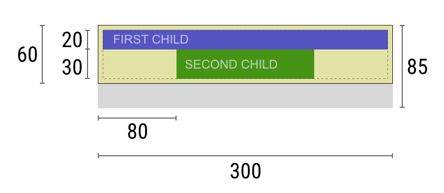
協商過程大致如下:
Widget:「嘿,父元件,我的 constraints(約束條件)是什麼?」
父元件:「你的寬度必須介於 0 到 300 像素之間,高度介於 0 到 85
之間。」
Widget:「嗯,既然我要有 5 像素的 padding,那我的子元件最多只能有 290 像素寬和 75
像素高。」
Widget:「嘿,第一個子元件,你的寬度必須介於 0 到 290 像素,高度介於 0 到
75 之間。」
第一個子元件:「OK,那我想要 290 像素寬、20 像素高。」
Widget:「嗯,因為我要把第二個子元件放在第一個下面,所以只剩下 55 像素高度給第二個子元件。」
Widget:「嘿,第二個子元件,你的寬度必須介於 0 到 290 之間,高度介於 0 到
55 之間。」
第二個子元件:「OK,我想要 140 像素寬、30 像素高。」
Widget:「很好。我的第一個子元件位置是 x: 5 和 y: 5,第二個子元件位置是 x: 80
和 y: 25。」
Widget:「嘿,父元件,我決定我的尺寸是 300 像素寬、60 像素高。」
限制
#Flutter 的版面配置引擎設計為單次傳遞(one-pass)流程。 這代表 Flutter 能非常有效率地進行元件(Widget)版面配置,但也帶來一些限制:
-
元件只能在父元件給定的 constraints(約束條件)內決定自己的尺寸。 這意味著元件通常 不能隨意設定任意尺寸。
元件無法得知也無法決定自己在螢幕上的位置,因為元件的位置是由父元件決定的。
由於父元件的尺寸與位置又取決於它自己的父元件,因此若不考慮整棵樹,無法精確定義任何元件的尺寸與位置。
-
如果子元件想要的尺寸與父元件不同,而父元件又沒有足夠資訊來對齊它,那麼子元件的尺寸可能會被忽略。 定義對齊時請具體明確。
在 Flutter 中,元件(Widget)是由其底層的 RenderBox
物件所渲染(render)。Flutter 中許多 box,特別是只包含單一子元件的那些,會將自己的 constraint 傳遞給子元件。
一般來說,根據如何處理 constraints(約束條件),box 可分為三類:
-
嘗試盡可能填滿空間的 box。
例如
Center和ListView所用的 box。 -
嘗試和其子元件一樣大小的 box。
例如
Transform和Opacity所用的 box。 -
嘗試成為特定尺寸的 box。
例如
Image和Text所用的 box。
有些元件,例如 Container,會根據建構子的參數類型而有所不同。
Container
建構子預設會嘗試盡可能大,但如果你給它一個 width,它就會盡量符合該特定尺寸。
其他元件,例如 Row 和 Column
(flex boxes),則會根據給定的 constraints(約束條件)而有所不同,詳見 Flex 章節。
範例
#想要互動式體驗,請使用下方 DartPad。 利用編號的水平捲動條可以切換 29 個不同範例。
import 'package:flutter/material.dart';
void main() => runApp(const HomePage());
const Color red = Colors.red;
const Color green = Colors.green;
const Color blue = Colors.blue;
const TextStyle big = TextStyle(fontSize: 30);
//////////////////////////////////////////////////
class HomePage extends StatelessWidget {
const HomePage({super.key});
@override
Widget build(BuildContext context) {
return const FlutterLayoutArticle([
Example1(),
Example2(),
Example3(),
Example4(),
Example5(),
Example6(),
Example7(),
Example8(),
Example9(),
Example10(),
Example11(),
Example12(),
Example13(),
Example14(),
Example15(),
Example16(),
Example17(),
Example18(),
Example19(),
Example20(),
Example21(),
Example22(),
Example23(),
Example24(),
Example25(),
Example26(),
Example27(),
Example28(),
Example29(),
]);
}
}
//////////////////////////////////////////////////
abstract class Example extends StatelessWidget {
const Example({super.key});
String get code;
String get explanation;
}
//////////////////////////////////////////////////
class FlutterLayoutArticle extends StatefulWidget {
const FlutterLayoutArticle(this.examples, {super.key});
final List<Example> examples;
@override
State<FlutterLayoutArticle> createState() => _FlutterLayoutArticleState();
}
//////////////////////////////////////////////////
class _FlutterLayoutArticleState extends State<FlutterLayoutArticle> {
late int count;
late Widget example;
late String code;
late String explanation;
@override
void initState() {
count = 1;
code = const Example1().code;
explanation = const Example1().explanation;
super.initState();
}
@override
void didUpdateWidget(FlutterLayoutArticle oldWidget) {
super.didUpdateWidget(oldWidget);
var example = widget.examples[count - 1];
code = example.code;
explanation = example.explanation;
}
@override
Widget build(BuildContext context) {
return MaterialApp(
debugShowCheckedModeBanner: false,
title: 'Flutter Layout Article',
home: SafeArea(
child: Material(
color: Colors.black,
child: FittedBox(
child: Container(
width: 400,
height: 670,
color: const Color(0xFFCCCCCC),
child: Column(
crossAxisAlignment: CrossAxisAlignment.center,
children: [
Expanded(
child: ConstrainedBox(
constraints: const BoxConstraints.tightFor(
width: double.infinity,
height: double.infinity,
),
child: widget.examples[count - 1],
),
),
Container(
height: 50,
width: double.infinity,
color: Colors.black,
child: SingleChildScrollView(
scrollDirection: Axis.horizontal,
child: Row(
mainAxisSize: MainAxisSize.min,
children: [
for (int i = 0; i < widget.examples.length; i++)
Container(
width: 58,
padding: const EdgeInsets.only(left: 4, right: 4),
child: button(i + 1),
),
],
),
),
),
Container(
height: 273,
color: Colors.grey[50],
child: Scrollbar(
child: SingleChildScrollView(
key: ValueKey(count),
child: Padding(
padding: const EdgeInsets.all(10),
child: Column(
children: [
Center(child: Text(code)),
const SizedBox(height: 15),
Text(
explanation,
style: TextStyle(
color: Colors.blue[900],
fontStyle: FontStyle.italic,
),
),
],
),
),
),
),
),
],
),
),
),
),
),
);
}
Widget button(int exampleNumber) {
return Button(
key: ValueKey('button$exampleNumber'),
isSelected: count == exampleNumber,
exampleNumber: exampleNumber,
onPressed: () {
showExample(
exampleNumber,
widget.examples[exampleNumber - 1].code,
widget.examples[exampleNumber - 1].explanation,
);
},
);
}
void showExample(int exampleNumber, String code, String explanation) {
setState(() {
count = exampleNumber;
this.code = code;
this.explanation = explanation;
});
}
}
//////////////////////////////////////////////////
class Button extends StatelessWidget {
final bool isSelected;
final int exampleNumber;
final VoidCallback onPressed;
const Button({
super.key,
required this.isSelected,
required this.exampleNumber,
required this.onPressed,
});
@override
Widget build(BuildContext context) {
return TextButton(
style: TextButton.styleFrom(
foregroundColor: Colors.white,
backgroundColor: isSelected ? Colors.grey : Colors.grey[800],
),
child: Text(exampleNumber.toString()),
onPressed: () {
Scrollable.ensureVisible(
context,
duration: const Duration(milliseconds: 350),
curve: Curves.easeOut,
alignment: 0.5,
);
onPressed();
},
);
}
}
//////////////////////////////////////////////////
class Example1 extends Example {
const Example1({super.key});
@override
final code = 'Container(color: red)';
@override
final explanation =
'The screen is the parent of the Container, '
'and it forces the Container to be exactly the same size as the screen.'
'\n\n'
'So the Container fills the screen and paints it red.';
@override
Widget build(BuildContext context) {
return Container(color: red);
}
}
//////////////////////////////////////////////////
class Example2 extends Example {
const Example2({super.key});
@override
final code = 'Container(width: 100, height: 100, color: red)';
@override
final String explanation =
'The red Container wants to be 100x100, but it can\'t, '
'because the screen forces it to be exactly the same size as the screen.'
'\n\n'
'So the Container fills the screen.';
@override
Widget build(BuildContext context) {
return Container(width: 100, height: 100, color: red);
}
}
//////////////////////////////////////////////////
class Example3 extends Example {
const Example3({super.key});
@override
final code =
'Center(\n'
' child: Container(width: 100, height: 100, color: red))';
@override
final String explanation =
'The screen forces the Center to be exactly the same size as the screen, '
'so the Center fills the screen.'
'\n\n'
'The Center tells the Container that it can be any size it wants, but not bigger than the screen.'
'Now the Container can indeed be 100x100.';
@override
Widget build(BuildContext context) {
return Center(child: Container(width: 100, height: 100, color: red));
}
}
//////////////////////////////////////////////////
class Example4 extends Example {
const Example4({super.key});
@override
final code =
'Align(\n'
' alignment: Alignment.bottomRight,\n'
' child: Container(width: 100, height: 100, color: red))';
@override
final String explanation =
'This is different from the previous example in that it uses Align instead of Center.'
'\n\n'
'Align also tells the Container that it can be any size it wants, but if there is empty space it won\'t center the Container. '
'Instead, it aligns the Container to the bottom-right of the available space.';
@override
Widget build(BuildContext context) {
return Align(
alignment: Alignment.bottomRight,
child: Container(width: 100, height: 100, color: red),
);
}
}
//////////////////////////////////////////////////
class Example5 extends Example {
const Example5({super.key});
@override
final code =
'Center(\n'
' child: Container(\n'
' color: red,\n'
' width: double.infinity,\n'
' height: double.infinity))';
@override
final String explanation =
'The screen forces the Center to be exactly the same size as the screen, '
'so the Center fills the screen.'
'\n\n'
'The Center tells the Container that it can be any size it wants, but not bigger than the screen.'
'The Container wants to be of infinite size, but since it can\'t be bigger than the screen, it just fills the screen.';
@override
Widget build(BuildContext context) {
return Center(
child: Container(
width: double.infinity,
height: double.infinity,
color: red,
),
);
}
}
//////////////////////////////////////////////////
class Example6 extends Example {
const Example6({super.key});
@override
final code = 'Center(child: Container(color: red))';
@override
final String explanation =
'The screen forces the Center to be exactly the same size as the screen, '
'so the Center fills the screen.'
'\n\n'
'The Center tells the Container that it can be any size it wants, but not bigger than the screen.'
'\n\n'
'Since the Container has no child and no fixed size, it decides it wants to be as big as possible, so it fills the whole screen.'
'\n\n'
'But why does the Container decide that? '
'Simply because that\'s a design decision by those who created the Container widget. '
'It could have been created differently, and you have to read the Container documentation to understand how it behaves, depending on the circumstances. ';
@override
Widget build(BuildContext context) {
return Center(child: Container(color: red));
}
}
//////////////////////////////////////////////////
class Example7 extends Example {
const Example7({super.key});
@override
final code =
'Center(\n'
' child: Container(color: red\n'
' child: Container(color: green, width: 30, height: 30)))';
@override
final String explanation =
'The screen forces the Center to be exactly the same size as the screen, '
'so the Center fills the screen.'
'\n\n'
'The Center tells the red Container that it can be any size it wants, but not bigger than the screen.'
'Since the red Container has no size but has a child, it decides it wants to be the same size as its child.'
'\n\n'
'The red Container tells its child that it can be any size it wants, but not bigger than the screen.'
'\n\n'
'The child is a green Container that wants to be 30x30.'
'\n\n'
'Since the red `Container` has no size but has a child, it decides it wants to be the same size as its child. '
'The red color isn\'t visible, since the green Container entirely covers all of the red Container.';
@override
Widget build(BuildContext context) {
return Center(
child: Container(
color: red,
child: Container(color: green, width: 30, height: 30),
),
);
}
}
//////////////////////////////////////////////////
class Example8 extends Example {
const Example8({super.key});
@override
final code =
'Center(\n'
' child: Container(color: red\n'
' padding: const EdgeInsets.all(20),\n'
' child: Container(color: green, width: 30, height: 30)))';
@override
final String explanation =
'The red Container sizes itself to its children size, but it takes its own padding into consideration. '
'So it is also 30x30 plus padding. '
'The red color is visible because of the padding, and the green Container has the same size as in the previous example.';
@override
Widget build(BuildContext context) {
return Center(
child: Container(
padding: const EdgeInsets.all(20),
color: red,
child: Container(color: green, width: 30, height: 30),
),
);
}
}
//////////////////////////////////////////////////
class Example9 extends Example {
const Example9({super.key});
@override
final code =
'ConstrainedBox(\n'
' constraints: BoxConstraints(\n'
' minWidth: 70, minHeight: 70,\n'
' maxWidth: 150, maxHeight: 150),\n'
' child: Container(color: red, width: 10, height: 10)))';
@override
final String explanation =
'You might guess that the Container has to be between 70 and 150 pixels, but you would be wrong. '
'The ConstrainedBox only imposes ADDITIONAL constraints from those it receives from its parent.'
'\n\n'
'Here, the screen forces the ConstrainedBox to be exactly the same size as the screen, '
'so it tells its child Container to also assume the size of the screen, '
'thus ignoring its \'constraints\' parameter.';
@override
Widget build(BuildContext context) {
return ConstrainedBox(
constraints: const BoxConstraints(
minWidth: 70,
minHeight: 70,
maxWidth: 150,
maxHeight: 150,
),
child: Container(color: red, width: 10, height: 10),
);
}
}
//////////////////////////////////////////////////
class Example10 extends Example {
const Example10({super.key});
@override
final code =
'Center(\n'
' child: ConstrainedBox(\n'
' constraints: BoxConstraints(\n'
' minWidth: 70, minHeight: 70,\n'
' maxWidth: 150, maxHeight: 150),\n'
' child: Container(color: red, width: 10, height: 10))))';
@override
final String explanation =
'Now, Center allows ConstrainedBox to be any size up to the screen size.'
'\n\n'
'The ConstrainedBox imposes ADDITIONAL constraints from its \'constraints\' parameter onto its child.'
'\n\n'
'The Container must be between 70 and 150 pixels. It wants to have 10 pixels, so it will end up having 70 (the MINIMUM).';
@override
Widget build(BuildContext context) {
return Center(
child: ConstrainedBox(
constraints: const BoxConstraints(
minWidth: 70,
minHeight: 70,
maxWidth: 150,
maxHeight: 150,
),
child: Container(color: red, width: 10, height: 10),
),
);
}
}
//////////////////////////////////////////////////
class Example11 extends Example {
const Example11({super.key});
@override
final code =
'Center(\n'
' child: ConstrainedBox(\n'
' constraints: BoxConstraints(\n'
' minWidth: 70, minHeight: 70,\n'
' maxWidth: 150, maxHeight: 150),\n'
' child: Container(color: red, width: 1000, height: 1000))))';
@override
final String explanation =
'Center allows ConstrainedBox to be any size up to the screen size.'
'The ConstrainedBox imposes ADDITIONAL constraints from its \'constraints\' parameter onto its child'
'\n\n'
'The Container must be between 70 and 150 pixels. It wants to have 1000 pixels, so it ends up having 150 (the MAXIMUM).';
@override
Widget build(BuildContext context) {
return Center(
child: ConstrainedBox(
constraints: const BoxConstraints(
minWidth: 70,
minHeight: 70,
maxWidth: 150,
maxHeight: 150,
),
child: Container(color: red, width: 1000, height: 1000),
),
);
}
}
//////////////////////////////////////////////////
class Example12 extends Example {
const Example12({super.key});
@override
final code =
'Center(\n'
' child: ConstrainedBox(\n'
' constraints: BoxConstraints(\n'
' minWidth: 70, minHeight: 70,\n'
' maxWidth: 150, maxHeight: 150),\n'
' child: Container(color: red, width: 100, height: 100))))';
@override
final String explanation =
'Center allows ConstrainedBox to be any size up to the screen size.'
'ConstrainedBox imposes ADDITIONAL constraints from its \'constraints\' parameter onto its child.'
'\n\n'
'The Container must be between 70 and 150 pixels. It wants to have 100 pixels, and that\'s the size it has, since that\'s between 70 and 150.';
@override
Widget build(BuildContext context) {
return Center(
child: ConstrainedBox(
constraints: const BoxConstraints(
minWidth: 70,
minHeight: 70,
maxWidth: 150,
maxHeight: 150,
),
child: Container(color: red, width: 100, height: 100),
),
);
}
}
//////////////////////////////////////////////////
class Example13 extends Example {
const Example13({super.key});
@override
final code =
'UnconstrainedBox(\n'
' child: Container(color: red, width: 20, height: 50));';
@override
final String explanation =
'The screen forces the UnconstrainedBox to be exactly the same size as the screen.'
'However, the UnconstrainedBox lets its child Container be any size it wants.';
@override
Widget build(BuildContext context) {
return UnconstrainedBox(
child: Container(color: red, width: 20, height: 50),
);
}
}
//////////////////////////////////////////////////
class Example14 extends Example {
const Example14({super.key});
@override
final code =
'UnconstrainedBox(\n'
' child: Container(color: red, width: 4000, height: 50));';
@override
final String explanation =
'The screen forces the UnconstrainedBox to be exactly the same size as the screen, '
'and UnconstrainedBox lets its child Container be any size it wants.'
'\n\n'
'Unfortunately, in this case the Container has 4000 pixels of width and is too big to fit in the UnconstrainedBox, '
'so the UnconstrainedBox displays the much dreaded "overflow warning".';
@override
Widget build(BuildContext context) {
return UnconstrainedBox(
child: Container(color: red, width: 4000, height: 50),
);
}
}
//////////////////////////////////////////////////
class Example15 extends Example {
const Example15({super.key});
@override
final code =
'OverflowBox(\n'
' minWidth: 0,'
' minHeight: 0,'
' maxWidth: double.infinity,'
' maxHeight: double.infinity,'
' child: Container(color: red, width: 4000, height: 50));';
@override
final String explanation =
'The screen forces the OverflowBox to be exactly the same size as the screen, '
'and OverflowBox lets its child Container be any size it wants.'
'\n\n'
'OverflowBox is similar to UnconstrainedBox, and the difference is that it won\'t display any warnings if the child doesn\'t fit the space.'
'\n\n'
'In this case the Container is 4000 pixels wide, and is too big to fit in the OverflowBox, '
'but the OverflowBox simply shows as much as it can, with no warnings given.';
@override
Widget build(BuildContext context) {
return OverflowBox(
minWidth: 0,
minHeight: 0,
maxWidth: double.infinity,
maxHeight: double.infinity,
child: Container(color: red, width: 4000, height: 50),
);
}
}
//////////////////////////////////////////////////
class Example16 extends Example {
const Example16({super.key});
@override
final code =
'UnconstrainedBox(\n'
' child: Container(color: Colors.red, width: double.infinity, height: 100));';
@override
final String explanation =
'This won\'t render anything, and you\'ll see an error in the console.'
'\n\n'
'The UnconstrainedBox lets its child be any size it wants, '
'however its child is a Container with infinite size.'
'\n\n'
'Flutter can\'t render infinite sizes, so it throws an error with the following message: '
'"BoxConstraints forces an infinite width."';
@override
Widget build(BuildContext context) {
return UnconstrainedBox(
child: Container(color: Colors.red, width: double.infinity, height: 100),
);
}
}
//////////////////////////////////////////////////
class Example17 extends Example {
const Example17({super.key});
@override
final code =
'UnconstrainedBox(\n'
' child: LimitedBox(maxWidth: 100,\n'
' child: Container(color: Colors.red,\n'
' width: double.infinity, height: 100));';
@override
final String explanation =
'Here you won\'t get an error anymore, '
'because when the LimitedBox is given an infinite size by the UnconstrainedBox, '
'it passes a maximum width of 100 down to its child.'
'\n\n'
'If you swap the UnconstrainedBox for a Center widget, '
'the LimitedBox won\'t apply its limit anymore (since its limit is only applied when it gets infinite constraints), '
'and the width of the Container is allowed to grow past 100.'
'\n\n'
'This explains the difference between a LimitedBox and a ConstrainedBox.';
@override
Widget build(BuildContext context) {
return UnconstrainedBox(
child: LimitedBox(
maxWidth: 100,
child: Container(
color: Colors.red,
width: double.infinity,
height: 100,
),
),
);
}
}
//////////////////////////////////////////////////
class Example18 extends Example {
const Example18({super.key});
@override
final code =
'FittedBox(\n'
' child: Text(\'Some Example Text.\'));';
@override
final String explanation =
'The screen forces the FittedBox to be exactly the same size as the screen.'
'The Text has some natural width (also called its intrinsic width) that depends on the amount of text, its font size, and so on.'
'\n\n'
'The FittedBox lets the Text be any size it wants, '
'but after the Text tells its size to the FittedBox, '
'the FittedBox scales the Text until it fills all of the available width.';
@override
Widget build(BuildContext context) {
return const FittedBox(child: Text('Some Example Text.'));
}
}
//////////////////////////////////////////////////
class Example19 extends Example {
const Example19({super.key});
@override
final code =
'Center(\n'
' child: FittedBox(\n'
' child: Text(\'Some Example Text.\')));';
@override
final String explanation =
'But what happens if you put the FittedBox inside of a Center widget? '
'The Center lets the FittedBox be any size it wants, up to the screen size.'
'\n\n'
'The FittedBox then sizes itself to the Text, and lets the Text be any size it wants.'
'\n\n'
'Since both FittedBox and the Text have the same size, no scaling happens.';
@override
Widget build(BuildContext context) {
return const Center(child: FittedBox(child: Text('Some Example Text.')));
}
}
////////////////////////////////////////////////////
class Example20 extends Example {
const Example20({super.key});
@override
final code =
'Center(\n'
' child: FittedBox(\n'
' child: Text(\'…\')));';
@override
final String explanation =
'However, what happens if FittedBox is inside of a Center widget, but the Text is too large to fit the screen?'
'\n\n'
'FittedBox tries to size itself to the Text, but it can\'t be bigger than the screen. '
'It then assumes the screen size, and resizes Text so that it fits the screen, too.';
@override
Widget build(BuildContext context) {
return const Center(
child: FittedBox(
child: Text(
'This is some very very very large text that is too big to fit a regular screen in a single line.',
),
),
);
}
}
//////////////////////////////////////////////////
class Example21 extends Example {
const Example21({super.key});
@override
final code =
'Center(\n'
' child: Text(\'…\'));';
@override
final String explanation =
'If, however, you remove the FittedBox, '
'the Text gets its maximum width from the screen, '
'and breaks the line so that it fits the screen.';
@override
Widget build(BuildContext context) {
return const Center(
child: Text(
'This is some very very very large text that is too big to fit a regular screen in a single line.',
),
);
}
}
//////////////////////////////////////////////////
class Example22 extends Example {
const Example22({super.key});
@override
final code =
'FittedBox(\n'
' child: Container(\n'
' height: 20, width: double.infinity));';
@override
final String explanation =
'FittedBox can only scale a widget that is BOUNDED (has non-infinite width and height).'
'Otherwise, it won\'t render anything, and you\'ll see an error in the console.';
@override
Widget build(BuildContext context) {
return FittedBox(
child: Container(height: 20, width: double.infinity, color: Colors.red),
);
}
}
//////////////////////////////////////////////////
class Example23 extends Example {
const Example23({super.key});
@override
final code =
'Row(children:[\n'
' Container(color: red, child: Text(\'Hello!\'))\n'
' Container(color: green, child: Text(\'Goodbye!\'))]';
@override
final String explanation =
'The screen forces the Row to be exactly the same size as the screen.'
'\n\n'
'Just like an UnconstrainedBox, the Row won\'t impose any constraints onto its children, '
'and instead lets them be any size they want.'
'\n\n'
'The Row then puts them side-by-side, and any extra space remains empty.';
@override
Widget build(BuildContext context) {
return Row(
children: [
Container(
color: red,
child: const Text('Hello!', style: big),
),
Container(
color: green,
child: const Text('Goodbye!', style: big),
),
],
);
}
}
//////////////////////////////////////////////////
class Example24 extends Example {
const Example24({super.key});
@override
final code =
'Row(children:[\n'
' Container(color: red, child: Text(\'…\'))\n'
' Container(color: green, child: Text(\'Goodbye!\'))]';
@override
final String explanation =
'Since the Row won\'t impose any constraints onto its children, '
'it\'s quite possible that the children might be too big to fit the available width of the Row.'
'In this case, just like an UnconstrainedBox, the Row displays the "overflow warning".';
@override
Widget build(BuildContext context) {
return Row(
children: [
Container(
color: red,
child: const Text(
'This is a very long text that '
'won\'t fit the line.',
style: big,
),
),
Container(
color: green,
child: const Text('Goodbye!', style: big),
),
],
);
}
}
//////////////////////////////////////////////////
class Example25 extends Example {
const Example25({super.key});
@override
final code =
'Row(children:[\n'
' Expanded(\n'
' child: Container(color: red, child: Text(\'…\')))\n'
' Container(color: green, child: Text(\'Goodbye!\'))]';
@override
final String explanation =
'When a Row\'s child is wrapped in an Expanded widget, the Row won\'t let this child define its own width anymore.'
'\n\n'
'Instead, it defines the Expanded width according to the other children, and only then the Expanded widget forces the original child to have the Expanded\'s width.'
'\n\n'
'In other words, once you use Expanded, the original child\'s width becomes irrelevant, and is ignored.';
@override
Widget build(BuildContext context) {
return Row(
children: [
Expanded(
child: Center(
child: Container(
color: red,
child: const Text(
'This is a very long text that won\'t fit the line.',
style: big,
),
),
),
),
Container(
color: green,
child: const Text('Goodbye!', style: big),
),
],
);
}
}
//////////////////////////////////////////////////
class Example26 extends Example {
const Example26({super.key});
@override
final code =
'Row(children:[\n'
' Expanded(\n'
' child: Container(color: red, child: Text(\'…\')))\n'
' Expanded(\n'
' child: Container(color: green, child: Text(\'Goodbye!\'))]';
@override
final String explanation =
'If all of Row\'s children are wrapped in Expanded widgets, each Expanded has a size proportional to its flex parameter, '
'and only then each Expanded widget forces its child to have the Expanded\'s width.'
'\n\n'
'In other words, Expanded ignores the preferred width of its children.';
@override
Widget build(BuildContext context) {
return Row(
children: [
Expanded(
child: Container(
color: red,
child: const Text(
'This is a very long text that won\'t fit the line.',
style: big,
),
),
),
Expanded(
child: Container(
color: green,
child: const Text('Goodbye!', style: big),
),
),
],
);
}
}
//////////////////////////////////////////////////
class Example27 extends Example {
const Example27({super.key});
@override
final code =
'Row(children:[\n'
' Flexible(\n'
' child: Container(color: red, child: Text(\'…\')))\n'
' Flexible(\n'
' child: Container(color: green, child: Text(\'Goodbye!\'))]';
@override
final String explanation =
'The only difference if you use Flexible instead of Expanded, '
'is that Flexible lets its child be SMALLER than the Flexible width, '
'while Expanded forces its child to have the same width of the Expanded.'
'\n\n'
'But both Expanded and Flexible ignore their children\'s width when sizing themselves.'
'\n\n'
'This means that it\'s IMPOSSIBLE to expand Row children proportionally to their sizes. '
'The Row either uses the exact child\'s width, or ignores it completely when you use Expanded or Flexible.';
@override
Widget build(BuildContext context) {
return Row(
children: [
Flexible(
child: Container(
color: red,
child: const Text(
'This is a very long text that won\'t fit the line.',
style: big,
),
),
),
Flexible(
child: Container(
color: green,
child: const Text('Goodbye!', style: big),
),
),
],
);
}
}
//////////////////////////////////////////////////
class Example28 extends Example {
const Example28({super.key});
@override
final code =
'Scaffold(\n'
' body: Container(color: blue,\n'
' child: Column(\n'
' children: [\n'
' Text(\'Hello!\'),\n'
' Text(\'Goodbye!\')])))';
@override
final String explanation =
'The screen forces the Scaffold to be exactly the same size as the screen, '
'so the Scaffold fills the screen.'
'\n\n'
'The Scaffold tells the Container that it can be any size it wants, but not bigger than the screen.'
'\n\n'
'When a widget tells its child that it can be smaller than a certain size, '
'we say the widget supplies "loose" constraints to its child. More on that later.';
@override
Widget build(BuildContext context) {
return Scaffold(
body: Container(
color: blue,
child: const Column(children: [Text('Hello!'), Text('Goodbye!')]),
),
);
}
}
//////////////////////////////////////////////////
class Example29 extends Example {
const Example29({super.key});
@override
final code =
'Scaffold(\n'
' body: Container(color: blue,\n'
' child: SizedBox.expand(\n'
' child: Column(\n'
' children: [\n'
' Text(\'Hello!\'),\n'
' Text(\'Goodbye!\')]))))';
@override
final String explanation =
'If you want the Scaffold\'s child to be exactly the same size as the Scaffold itself, '
'you can wrap its child with SizedBox.expand.'
'\n\n'
'When a widget tells its child that it must be of a certain size, '
'we say the widget supplies "tight" constraints to its child. More on that later.';
@override
Widget build(BuildContext context) {
return Scaffold(
body: SizedBox.expand(
child: Container(
color: blue,
child: const Column(children: [Text('Hello!'), Text('Goodbye!')]),
),
),
);
}
}
//////////////////////////////////////////////////如果你願意,也可以從 這個 GitHub 儲存庫 取得程式碼。
這些範例會在接下來的章節中進行說明。
範例 1
#
Container(color: red)
螢幕是 Container 的父層,並且
強制 Container 的尺寸必須與螢幕完全相同。
因此,Container 會填滿整個螢幕,並將其繪製為紅色。
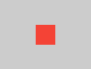
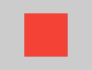
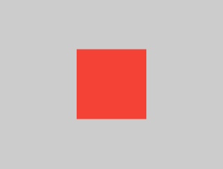
範例 2
#
Container(width: 100, height: 100, color: red)
紅色的 Container 想要成為 100 × 100,
但它無法達成,因為螢幕強制它必須
與螢幕完全相同的大小。
因此,Container 會填滿整個螢幕。
範例 3
#
Center(child: Container(width: 100, height: 100, color: red))
螢幕會強制讓 Center 的尺寸與螢幕完全相同,因此 Center 會填滿整個螢幕。
Center 告訴 Container 它可以是任何想要的大小,但不能超過螢幕的大小。現在 Container 確實可以是 100 × 100。
範例 4
#
Align(
  alignment: Alignment.bottomRight,
  child: Container(width: 100, height: 100, color: red),
)
這個範例與前一個不同之處在於它使用了 Align,而不是 Center。
Align 同樣告訴 Container 可以是任意大小,但如果有多餘的空間,它不會將 Container 置中。相反地,它會將容器對齊到可用空間的右下角。
範例 5
#
Center(
  child: Container(
    width: double.infinity,
    height: double.infinity,
    color: red,
  ),
)
螢幕會強制 Center 的大小必須與螢幕完全相同,因此 Center 會填滿整個螢幕。
Center 告訴 Container 它可以是任何想要的大小,但不能超過螢幕的大小。Container 希望自己是無限大,但因為不能比螢幕大,所以它就填滿了螢幕。
範例 6
#
Center(child: Container(color: red))
螢幕會強制 Center 與螢幕本身的大小完全相同,因此 Center 會填滿整個螢幕。
Center 告訴 Container 它可以是任何想要的大小,但不能超過螢幕的尺寸。由於 Container 沒有子元件(child)且沒有固定大小,因此它決定要盡可能大,所以會填滿整個螢幕。
但為什麼 Container 會這麼決定呢?
這純粹是 Container 元件(Widget)設計者的設計決策。它本來也可以有不同的設計方式,因此你必須閱讀
Container
API 文件,才能根據不同情境了解它的行為。
範例 7
#
Center(
  child: Container(
    color: red,
    child: Container(color: green, width: 30, height: 30),
  ),
)
螢幕會強制 Center 的大小必須與螢幕完全相同,因此 Center 會填滿整個螢幕。
Center 告訴紅色的 Container,它可以是任何想要的大小,但不能超過螢幕的尺寸。由於紅色的 Container 沒有自己的大小,但有一個子元件(child),所以它決定要和它的子元件一樣大。
紅色的 Container 告訴它的子元件可以是任何想要的大小,但不能超過螢幕。
這個子元件是一個綠色的 Container,它希望自己是 30 × 30。由於紅色的 Container 會將自己調整為與子元件一樣的大小,因此它的尺寸也是 30 × 30。紅色的顏色看不到,因為綠色的
Container 完全覆蓋了紅色的 Container。
範例 8
#
Center(
  child: Container(
    padding: const EdgeInsets.all(20),
    color: red,
    child: Container(color: green, width: 30, height: 30),
  ),
)
紅色的 Container 會根據其子元件(children)的大小自我調整尺寸,
但同時也會考慮到自身的內距(padding)。
因此,它的尺寸為 30 × 30 再加上 padding。
由於有 padding,紅色區域會顯示出來,
而綠色的 Container 則與前一個範例中的尺寸相同。
範例 9
#
ConstrainedBox(
  constraints: const BoxConstraints(
    minWidth: 70,
    minHeight: 70,
    maxWidth: 150,
    maxHeight: 150,
  ),
  child: Container(color: red, width: 10, height: 10),
)
你可能會猜測 Container 必須介於 70 到 150 像素之間,但這其實是錯誤的。
ConstrainedBox 只會在它從父元件接收到的限制上,施加額外的限制。
在這裡,螢幕強制 ConstrainedBox 必須與螢幕大小完全相同,因此它會告訴其子元件 Container 也要採用螢幕的大小,這樣就會忽略它的
constraints 參數。
範例 10
#
Center(
  child: ConstrainedBox(
    constraints: const BoxConstraints(
      minWidth: 70,
      minHeight: 70,
      maxWidth: 150,
      maxHeight: 150,
    ),
    child: Container(color: red, width: 10, height: 10),
  ),
)
現在,Center 允許 ConstrainedBox 的尺寸可以是任意大小,最大不超過螢幕大小。ConstrainedBox
會根據其 constraints 參數,對其子元件施加額外的限制。
這個 Container 必須介於 70 到 150 像素之間。它希望自己只有 10 像素,因此最後會被限制為 70(最小值)。
範例 11
#
Center(
  child: ConstrainedBox(
    constraints: const BoxConstraints(
      minWidth: 70,
      minHeight: 70,
      maxWidth: 150,
      maxHeight: 150,
    ),
    child: Container(color: red, width: 1000, height: 1000),
  ),
)
Center 允許 ConstrainedBox 的尺寸可以在螢幕大小以內的任意範圍。ConstrainedBox 會根據其
constraints 參數對其子元件施加額外的限制。
Container 必須介於 70 到 150 像素之間。
它希望有 1000 像素,
但最終會是 150(最大值)。
範例 12
#
Center(
  child: ConstrainedBox(
    constraints: const BoxConstraints(
      minWidth: 70,
      minHeight: 70,
      maxWidth: 150,
      maxHeight: 150,
    ),
    child: Container(color: red, width: 100, height: 100),
  ),
)
Center 允許 ConstrainedBox 的尺寸可以在螢幕大小以內的任何範圍。ConstrainedBox 會根據其
constraints 參數,對其子元件施加額外的限制。
Container 必須介於 70 到 150 像素之間。它希望有 100 像素,因此實際尺寸就是 100 像素,因為這個值介於 70 和 150 之間。
範例 13
#
UnconstrainedBox(
  child: Container(color: red, width: 20, height: 50),
)
螢幕會強制 UnconstrainedBox 的大小
與螢幕完全相同。然而,UnconstrainedBox
則允許其子元件 Container 擁有任意大小。
範例 14
#
UnconstrainedBox(
  child: Container(color: red, width: 4000, height: 50),
)
螢幕會強制 UnconstrainedBox 的大小
必須與螢幕完全相同,而 UnconstrainedBox
則允許其子元件 Container 可以是任何它想要的大小。
不幸的是,在這個例子中,Container
寬度為 4000 像素,太大而無法容納在 UnconstrainedBox 內,
因此 UnconstrainedBox 顯示了令人頭痛的「溢出警告」。
範例 15
#
OverflowBox(
  minWidth: 0,
  minHeight: 0,
  maxWidth: double.infinity,
  maxHeight: double.infinity,
  child: Container(color: red, width: 4000, height: 50),
)
螢幕會強制 OverflowBox 的大小與螢幕完全相同,而 OverflowBox 則允許其子元件 Container 可以是任何想要的大小。
OverflowBox 與 UnconstrainedBox 類似;不同之處在於,如果子元件無法適應空間,OverflowBox
不會顯示任何警告。
在這個例子中,Container 的寬度為 4000 像素,太大無法放入 OverflowBox,但 OverflowBox
只會顯示能顯示的部分,不會出現任何警告。
範例 16
#
UnconstrainedBox(
  child: Container(color: Colors.red, width: double.infinity, height: 100),
)
這段程式碼不會渲染任何內容,並且你會在主控台看到錯誤訊息。
UnconstrainedBox 允許其子元件(child)擁有任意大小,
但它的子元件是一個具有無限大小的 Container。
Flutter 無法渲染(render)無限大小,因此會拋出錯誤,
並顯示以下訊息:BoxConstraints forces an infinite width.
範例 17
#
UnconstrainedBox(
  child: LimitedBox(
    maxWidth: 100,
    child: Container(
      color: Colors.red,
      width: double.infinity,
      height: 100,
    ),
  ),
)
這裡你將不會再遇到錯誤,
因為當 LimitedBox 被 UnconstrainedBox
給予無限大小時,
它會將最大寬度 100 向下傳遞給其子元件。
如果你將 UnconstrainedBox 換成 Center 元件(Widget),
LimitedBox 就不會再套用其限制
(因為它的限制只會在收到無限約束時才會生效),而 Container
的寬度就可以超過 100。
這說明了 LimitedBox
和 ConstrainedBox 之間的差異。
範例 18
#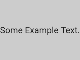
const FittedBox(child: Text('Some Example Text.'))
螢幕會強制 FittedBox 的尺寸與螢幕完全相同。Text 有其自然寬度(也稱為本質寬度,intrinsic width),這取決於文字的長度、字型大小等等。
FittedBox 允許 Text 可以是任何想要的尺寸,但在 Text 將其尺寸回報給 FittedBox
之後,FittedBox 會將 Text 放大,直到填滿所有可用的寬度為止。
範例 19
#
const Center(child: FittedBox(child: Text('Some Example Text.')))
但是,如果你將 FittedBox 放在 Center 元件(Widget)裡會發生什麼事呢?Center 會讓 FittedBox
可以根據自己的需求設定任何大小,只要不超過螢幕的尺寸。
接著,FittedBox 會根據 Text 來決定自身大小,並讓 Text 可以自由設定所需的尺寸。
由於 FittedBox 和 Text 的大小相同,因此不會發生縮放。
範例 20
#
const Center(
  child: FittedBox(
    child: Text(
      'This is some very very very large text that is too big to fit a regular screen in a single line.',
    ),
  ),
)
然而,如果 FittedBox 位於 Center 元件(Widget)內部,但 Text 太大,無法容納在螢幕上時,會發生什麼情況呢?
FittedBox 會嘗試將自身尺寸設為 Text,
但它不能比螢幕還大。
因此,它會採用螢幕大小,
並將 Text 的尺寸調整為也能適應螢幕。
範例 21
#
const Center(
  child: Text(
    'This is some very very very large text that is too big to fit a regular screen in a single line.',
  ),
)
然而,如果你移除了 FittedBox,則 Text
會從螢幕取得其最大寬度,
並自動換行以符合螢幕的顯示範圍。
範例 22
#
FittedBox(
  child: Container(height: 20, width: double.infinity, color: Colors.red),
)
FittedBox 只能縮放具有邊界(即寬度和高度都不是無限大)的元件(Widget)。否則,它將不會渲染任何內容,並且你會在主控台看到錯誤訊息。
範例 23
#
Row(
  children: [
    Container(
      color: red,
      child: const Text('Hello!', style: big),
    ),
    Container(
      color: green,
      child: const Text('Goodbye!', style: big),
    ),
  ],
)
螢幕會強制將 Row 的尺寸設為與螢幕完全相同。
就像 UnconstrainedBox 一樣,Row 不會對其子元件(children)施加任何限制,而是讓它們可以有任何想要的尺寸。Row
則會將它們並排放置,任何多餘的空間則保持為空。
範例 24
#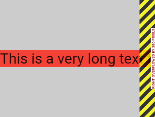
Row(
  children: [
    Container(
      color: red,
      child: const Text(
        'This is a very long text that '
        'won\'t fit the line.',
        style: big,
      ),
    ),
    Container(
      color: green,
      child: const Text('Goodbye!', style: big),
    ),
  ],
)
由於 Row 不會對其子元件施加任何限制,因此這些子元件很有可能會超出 Row 的可用寬度。在這種情況下,就像 UnconstrainedBox
一樣,Row 會顯示「溢出警告」。
範例 25
#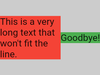
Row(
  children: [
    Expanded(
      child: Center(
        child: Container(
          color: red,
          child: const Text(
            'This is a very long text that won\'t fit the line.',
            style: big,
          ),
        ),
      ),
    ),
    Container(
      color: green,
      child: const Text('Goodbye!', style: big),
    ),
  ],
)
當 Row 的子元件(child)被包裹在 Expanded 元件(Widget)中時,
Row 將不再允許這個子元件自行決定其寬度。
取而代之的是,它會根據其他子元件來決定 Expanded 的寬度,
然後 Expanded 元件會強制原本的子元件擁有 Expanded 的寬度。
換句話說,一旦你使用 Expanded,
原本子元件的寬度就變得無關緊要,並且會被忽略。
範例 26
#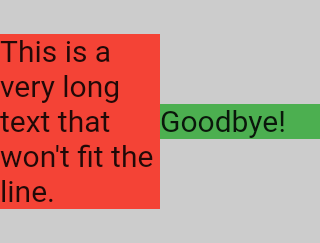
Row(
  children: [
    Expanded(
      child: Container(
        color: red,
        child: const Text(
          'This is a very long text that won\'t fit the line.',
          style: big,
        ),
      ),
    ),
    Expanded(
      child: Container(
        color: green,
        child: const Text('Goodbye!', style: big),
      ),
    ),
  ],
)
如果所有 Row 的子元件(children)都包裹在 Expanded 元件(Widget)中,
每個 Expanded 會根據其 flex 參數,取得與之成比例的大小,
然後每個 Expanded 元件會強制其子元件擁有
Expanded 的寬度。
換句話說,Expanded 會忽略其子元件的偏好寬度。
範例 27
#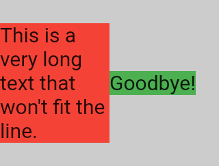
Row(
  children: [
    Flexible(
      child: Container(
        color: red,
        child: const Text(
          'This is a very long text that won\'t fit the line.',
          style: big,
        ),
      ),
    ),
    Flexible(
      child: Container(
        color: green,
        child: const Text('Goodbye!', style: big),
      ),
    ),
  ],
)
如果你使用 Flexible 取代 Expanded,唯一的差別在於,Flexible 允許其子元件(child)擁有與 Flexible
本身相同或更小的寬度,而 Expanded 則強制其子元件必須具有與 Expanded 完全相同的寬度。不過,Expanded
和 Flexible 在決定自身尺寸時,會忽略其子元件的寬度。
範例 28
#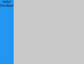
Scaffold(
  body: Container(
    color: blue,
    child: const Column(children: [Text('Hello!'), Text('Goodbye!')]),
  ),
)
螢幕會強制將 Scaffold 設為與螢幕完全相同的大小,因此 Scaffold 會填滿整個螢幕。
Scaffold 則告訴 Container 它可以是任何想要的大小,但不能超過螢幕的尺寸。
範例 29
#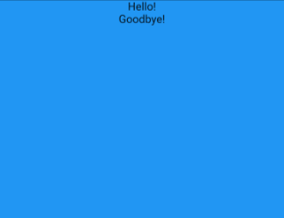
Scaffold(
  body: SizedBox.expand(
    child: Container(
      color: blue,
      child: const Column(children: [Text('Hello!'), Text('Goodbye!')]),
    ),
  ),
)
如果你希望 Scaffold 的子元件(child)與 Scaffold 本身完全相同大小,可以將其子元件包裹在 SizedBox.expand
中。
緊約束(Tight)與寬鬆約束(Loose constraints)
#你可能常聽到某個約束是「緊的」(tight)或「寬鬆的」(loose),那這到底是什麼意思呢?
緊約束(Tight constraints)
#緊約束 只提供一種可能性,也就是一個精確的尺寸。換句話說,緊約束的最大寬度等於最小寬度,最大高度也等於最小高度。
舉例來說,App 元件(Widget)就是這樣的例子,它被 RenderView
類別所包含:應用程式的 build
函式所回傳的子元件所使用的方塊(box),會被給予一個約束,強制它完全填滿應用程式的內容區域(通常是整個螢幕)。
另一個例子是:如果你在應用程式的 render tree 根部,將一堆方塊(box)彼此巢狀包裹,它們都會被緊約束強制,完全貼合彼此。
如果你打開 Flutter 的 box.dart 檔案並搜尋 BoxConstraints 建構函式,你會找到以下內容:
BoxConstraints.tight(Size size)
   : minWidth = size.width,
     maxWidth = size.width,
     minHeight = size.height,
     maxHeight = size.height;
如果你再次查看 範例 2,
螢幕會強制紅色的 Container
與螢幕的尺寸完全相同。
螢幕之所以能做到這一點,當然是因為它將緊約束(tight constraints)
傳遞給了 Container。
寬鬆約束(Loose constraints)
#寬鬆約束 指的是最小值為零且最大值為非零的約束。
有些盒子(box)會_放寬_傳入的約束, 也就是保留最大值,但移除最小值, 因此元件可以擁有最小寬度和高度都等於零。
最終,Center 的目的是將它從父元件(螢幕)收到的緊約束
轉換成給它子元件(Container)的寬鬆約束。
如果你再次查看 範例 3,
Center 允許紅色的 Container 變小,
但不能比螢幕大。
無界約束(Unbounded constraints)
#
在某些情況下,
盒子的約束是_無界_的,或稱為無限大。
這表示最大寬度或最大高度被設為 double.infinity。
當一個盒子試圖盡可能變大時, 如果給它無界約束,它將無法正常運作, 並且在除錯模式下會拋出例外。
最常見的情況是,
渲染盒子(render box)在彈性盒子(flex box)
(Row
或 Column)
以及在可滾動區域內
(例如 ListView
及其他 ScrollView
子類別)時,
會遇到無界約束。
舉例來說,ListView
會嘗試在交叉方向(cross-direction)上展開以適應可用空間
(也許它是一個垂直滾動的區塊,並嘗試與父元件一樣寬)。
如果你將一個垂直滾動的 ListView
巢狀在一個水平滾動的 ListView 內,
內層清單會嘗試變得盡可能寬,
而這個寬度是無限大,
因為外層在那個方向上是可滾動的。
下一節會說明你在 Flex 元件遇到無界約束時
可能會遇到的錯誤。
Flex
#
彈性盒子(flex box)(Row 和
Column)
在其主方向(primary direction)上的約束
是有界還是無界時,行為會有所不同。
如果彈性盒子的主方向約束是有界的, 它會嘗試變得盡可能大。
如果彈性盒子的主方向約束是無界的,
它會嘗試讓其子元件適應該空間。
每個子元件的 flex 值必須設為零,
也就是說,當彈性盒子位於另一個彈性盒子
或可滾動元件內時,不能使用 Expanded;
否則會拋出例外。
交叉方向(cross direction)
(Column
的寬度或 Row 的高度),
絕對不能是無界的,
否則無法合理地對齊其子元件。
學習特定元件的版面配置規則
#了解一般的版面配置規則是必要的,但這還不夠。
每個元件在套用一般規則時都有很大的自由度, 所以光看元件名稱,無法知道它的實際行為。
如果你嘗試猜測,很可能會猜錯。 除非你讀過它的文件,或研究過它的原始碼, 否則你無法確切知道一個元件的行為。
版面配置的原始碼通常很複雜, 所以閱讀文件可能會更好。 不過,如果你決定要研究版面配置的原始碼, 可以利用 IDE 的導覽功能輕鬆找到。
以下是一個範例:
-
在你的程式碼中找到一個
Column,並導覽到它的 原始碼。你可以在 Android Studio 或 IntelliJ 中使用command+B(macOS) 或control+B(Windows/Linux)來達成。 你會被帶到basic.dart檔案。 由於Column繼承自Flex,請再導覽到Flex的原始碼(同樣在basic.dart)。 -
往下捲動直到找到名為
createRenderObject()的方法。 如你所見,這個方法會回傳一個RenderFlex。 這就是Column的 render-object。 現在導覽到RenderFlex的原始碼, 你會進入flex.dart檔案。 -
再往下捲動直到找到名為
performLayout()的方法。 這個方法就是為Column做版面配置的地方。

原文作者:Marcelo Glasberg
Marcelo 最初將這篇內容發表於 Flutter: The Advanced Layout Rule Even Beginners Must Know (Medium)。我們非常喜歡這篇文章,因此邀請他授權 在 docs.flutter.dev 發表,他也很慷慨地同意了。感謝 Marcelo! 你可以在 GitHub 和 pub.dev 找到 Marcelo。
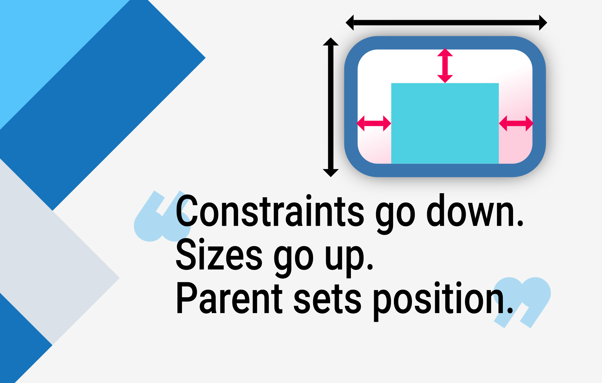
同時也感謝 Simon Lightfoot 製作了本文開頭的標題圖片。
Unless stated otherwise, the documentation on this site reflects Flutter 3.44.0. Page last updated on 2026-06-14. View source or report an issue.