給 SwiftUI 開發者的 Flutter 指南
有 SwiftUI 經驗、想要使用 Flutter 開發行動應用程式的開發者,應該參考本指南。
本文件說明如何將你現有的 SwiftUI 知識應用到 Flutter 上。
Flutter 是一個用於建構跨平台應用程式的框架,採用 Dart 程式語言。
若想了解 Dart 與 Swift 程式設計上的差異,請參考 Learning Dart as a Swift Developer
以及 Flutter concurrency for Swift developers。
你的 SwiftUI 知識與經驗,在使用 Flutter 開發時同樣非常有價值。
Flutter 在 iOS 與 macOS 執行時,也針對應用行為做了多項調整。
想了解詳細內容,請參閱 Platform adaptations。
本文件可作為食譜式指南,讓你依需求跳閱、查找最相關的問題。
本指南內嵌了範例程式碼。
只要在滑鼠懸停或聚焦時點擊「Open in DartPad」按鈕,即可在 DartPad 上開啟並執行部分範例。
概覽
#作為入門,請先觀看下方影片。
影片將說明 Flutter 在 iOS 上的運作方式,以及如何利用 Flutter 建構 iOS 應用程式。
Flutter 與 SwiftUI 的程式碼都用來描述 UI 的外觀與運作方式。
開發者稱這類程式碼為 宣告式框架(declarative framework)。
Views 與 Widgets 的比較
#SwiftUI 以 views(視圖)來表示 UI 元件。
你可以透過 modifiers(修飾器)來配置 views。
Text("Hello, World!") // <-- This is a View
  .padding(10)        // <-- This is a modifier of that View
Flutter 將 UI 元件(Widgets)表示為 widgets(元件)。
無論是 views 還是 widgets,都只會存在到需要被改變為止。 這種特性在這些語言中被稱為 不可變性(immutability)。 SwiftUI 以 View 修飾器(View modifier)的方式來表示 UI 元件屬性。 相較之下,Flutter 則同時使用 widgets(元件)來表示 UI 元件以及它們的屬性。
Padding(                         // <-- This is a Widget
  padding: EdgeInsets.all(10.0), // <-- So is this
  child: Text("Hello, World!"),  // <-- This, too
)));
在進行版面配置(layout)時,SwiftUI 與 Flutter 都是透過將 UI 元件(SwiftUI 稱為 Views,Flutter 稱為 Widgets)彼此巢狀嵌套來組合畫面。
版面配置流程
#SwiftUI 使用以下流程來排版 views:
- 父 view 向其子 view 提議一個尺寸。
- 所有後續的子 view:
- 向「自己的」子 view 提議尺寸
- 詢問該子 view 想要多大的尺寸
- 每個父 view 會以子 view 回傳的尺寸來渲染該子 view。
Flutter 的流程則略有不同:
父元件(Widget)將限制條件(constraints)下傳給其子元件。限制條件包含高度與寬度的最小值與最大值。
子元件嘗試決定自己的尺寸。這個過程會對自己的
children清單重複進行:- 通知子元件其可用的限制條件。
- 詢問子元件希望的尺寸為何。
父元件負責排版子元件。
- 如果子元件要求的尺寸符合限制條件,父元件就採用該尺寸。
- 如果子元件要求的尺寸不符合限制條件,父元件會將高度、寬度或兩者限制在允許的範圍內。
Flutter 與 SwiftUI 不同之處在於,父元件可以覆寫子元件想要的尺寸。元件(Widget)無法任意決定自己的尺寸,也無法得知或決定自己在螢幕上的位置,因為這由父元件決定。
若要強制子元件以特定尺寸渲染,父元件必須設定「緊縮限制條件」(tight constraints)。當限制條件的最小尺寸值等於最大尺寸值時,該限制條件就成為緊縮限制條件。
在 SwiftUI 中,views 可能會擴展至可用空間,或限制自己的尺寸以符合內容大小。 Flutter 的元件(Widgets)行為也類似。
然而,在 Flutter 中,父元件可以提供「無界限制條件」(unbounded constraints)。無界限制條件會將最大值設為無限大。
UnboundedBox(
  child: Container(
      width: double.infinity, height: double.infinity, color: red),
)
如果子元件(child)展開且具有無界約束(unbounded constraints), Flutter 會回傳溢出(overflow)警告:
UnconstrainedBox(
  child: Container(color: red, width: 4000, height: 50),
)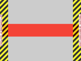
想了解 Flutter 中約束(constraints)的運作方式,請參閱Understanding constraints。
設計系統
#由於 Flutter 支援多平台,您的應用程式不需要遵循任何特定的設計系統。雖然本指南以 Material 元件(Widgets)為主,但您的 Flutter 應用程式可以使用多種不同的設計系統:
- 自訂 Material 元件(Widgets)
- 社群打造的元件(Widgets)
- 您自行開發的自訂元件(Widgets)
- 遵循 Apple 的人機介面指引(Human Interface Guidelines)的 Cupertino 元件(Widgets)
Watch on YouTube in a new tab: "Flutter 的 cupertino 函式庫給 iOS 開發者"
如果您正在尋找一個展現自訂設計系統的優秀參考應用程式,請參考 Wonderous。
UI 基礎
#本節將介紹 Flutter 的 UI 開發基礎,以及與 SwiftUI 的比較。內容包含如何開始開發應用程式、顯示靜態文字、建立按鈕、響應按下事件、顯示清單、網格等。
開始使用
#在 SwiftUI 中,您會使用 App 來啟動您的應用程式。
@main
struct MyApp: App {
    var body: some Scene {
        WindowGroup {
            HomePage()
        }
    }
}
另一種常見的 SwiftUI 實作方式,會將 app 的 body 放在struct中,並讓其符合View協定(protocol),如下所示:
struct HomePage: View {
  var body: some View {
    Text("Hello, World!")
  }
}
要啟動你的 Flutter 應用程式,請將你的應用程式實例傳遞給 runApp 函式。
void main() {
  runApp(const MyApp());
}
App 是一個元件(Widget)。其 build 方法描述了它所代表的使用者介面部分。 通常會以一個 WidgetApp 類別作為應用程式的起點, 例如 CupertinoApp。
class MyApp extends StatelessWidget {
  const MyApp({super.key});

  @override
  Widget build(BuildContext context) {
    // Returns a CupertinoApp that, by default,
    // has the look and feel of an iOS app.
    return const CupertinoApp(home: HomePage());
  }
}在HomePage中所使用的元件(Widget)可能會以Scaffold類別作為起點。
Scaffold實作了一個應用程式的基本版面配置結構。
class HomePage extends StatelessWidget {
  const HomePage({super.key});

  @override
  Widget build(BuildContext context) {
    return const Scaffold(body: Center(child: Text('Hello, World!')));
  }
}
請注意 Flutter 如何使用 Center 元件(Widget)。 SwiftUI 預設會將 view 的內容置中顯示。 但在 Flutter 中並非總是如此。 Scaffold 並不會將其 body 元件(Widget)置於螢幕中央。 若要讓文字置中,請將其包裹在 Center 元件(Widget)中。 想了解不同元件(Widgets)及其預設行為,請參考 Widget catalog。
新增按鈕
#在 SwiftUI 中,你可以使用 Button 結構(struct)來建立按鈕。
Button("Do something") {
  // this closure gets called when your
  // button is tapped
}
要在 Flutter 中達到相同的效果, 請使用 CupertinoButton 類別:
CupertinoButton(
  onPressed: () {
    // This closure is called when your button is tapped.
  },
  const Text('Do something'),
),
Flutter 提供多種具有預設樣式的按鈕可供使用。
CupertinoButton 類別來自 Cupertino 函式庫。
Cupertino 函式庫中的元件 (Widgets) 採用 Apple 的設計系統。
水平對齊元件
#在 SwiftUI 中,stack views(堆疊視圖)在版面設計上扮演重要角色。
有兩種不同的結構可以用來建立堆疊:
HStack用於水平 stack viewsVStack用於垂直 stack views
以下這個 SwiftUI 視圖會將地球圖示和文字
加入到一個水平 stack view 中:
HStack {
  Image(systemName: "globe")
  Text("Hello, world!")
}
Flutter 使用 Row,而不是 HStack:
Row(
  mainAxisAlignment: MainAxisAlignment.center,
  children: [Icon(CupertinoIcons.globe), Text('Hello, world!')],
),
Row 元件(Widget)需要在 children 參數中傳入 List<Widget>。 mainAxisAlignment 屬性用來告訴 Flutter 在有多餘空間時,應該如何排列子元件(children)。 MainAxisAlignment.center 會將子元件排列在主軸的中央。對於 Row 來說,主軸是水平方向。
垂直對齊元件
#以下範例是在前一節的基礎上進行擴充。
在 SwiftUI 中,你可以使用 VStack 將元件排列成垂直柱狀結構。
VStack {
  Image(systemName: "globe")
  Text("Hello, world!")
}
Flutter 使用與前一個範例相同的 Dart 程式碼,只是將 Column 換成 Row:
Column(
  mainAxisAlignment: MainAxisAlignment.center,
  children: [Icon(CupertinoIcons.globe), Text('Hello, world!')],
),
顯示清單檢視
#在 SwiftUI 中,你可以使用 List 基礎元件來顯示一系列的項目。 若要顯示一系列的模型物件,請確保使用者能夠識別你的模型物件。 要讓物件具有可識別性,可以使用 Identifiable 協定(protocol)。
struct Person: Identifiable {
  var name: String
}

var persons = [
  Person(name: "Person 1"),
  Person(name: "Person 2"),
  Person(name: "Person 3"),
]

struct ListWithPersons: View {
  let persons: [Person]
  var body: some View {
    List {
      ForEach(persons) { person in
        Text(person.name)
      }
    }
  }
}
這與 Flutter 偏好建立其清單元件(Widgets)的方式相似。
Flutter 不需要清單項目具有可識別性。
你只需設定要顯示的項目數量,然後為每個項目建立一個元件(Widget)。
class Person {
  String name;
  Person(this.name);
}

final List<Person> items = [
  Person('Person 1'),
  Person('Person 2'),
  Person('Person 3'),
];

class HomePage extends StatelessWidget {
  const HomePage({super.key});

  @override
  Widget build(BuildContext context) {
    return Scaffold(
      body: ListView.builder(
        itemCount: items.length,
        itemBuilder: (context, index) {
          return ListTile(title: Text(items[index].name));
        },
      ),
    );
  }
}
Flutter 在處理清單時有一些注意事項:
ListView元件(Widget)具有 builder 方法。 這類似於 SwiftUI 的List結構中的ForEach。ListView的itemCount參數用來設定ListView要顯示多少個項目。itemBuilder的 index 參數會介於 0 到 itemCount 減 1 之間。
前面的範例會為每個項目回傳一個 ListTile 元件(Widget)。 ListTile 元件包含像是 height 和 font-size 這樣的屬性。 這些屬性有助於建立清單。不過,Flutter 允許你回傳 幾乎任何能代表你資料的元件(Widget)。
顯示網格(Grid)
#在 SwiftUI 中建立非條件式的網格時, 你會使用 Grid 搭配 GridRow。
Grid {
  GridRow {
    Text("Row 1")
    Image(systemName: "square.and.arrow.down")
    Image(systemName: "square.and.arrow.up")
  }
  GridRow {
    Text("Row 2")
    Image(systemName: "square.and.arrow.down")
    Image(systemName: "square.and.arrow.up")
  }
}
要在 Flutter 中顯示格狀佈局,請使用 GridView 元件 (Widget)。 這個元件有多種建構函式可用。每個建構函式的目標相似,但所需的輸入參數不同。 以下範例使用 .builder() 初始化方式:
const widgets = [
  Text('Row 1'),
  Icon(CupertinoIcons.arrow_down_square),
  Icon(CupertinoIcons.arrow_up_square),
  Text('Row 2'),
  Icon(CupertinoIcons.arrow_down_square),
  Icon(CupertinoIcons.arrow_up_square),
];

class HomePage extends StatelessWidget {
  const HomePage({super.key});

  @override
  Widget build(BuildContext context) {
    return Scaffold(
      body: GridView.builder(
        gridDelegate: const SliverGridDelegateWithFixedCrossAxisCount(
          crossAxisCount: 3,
          mainAxisExtent: 40,
        ),
        itemCount: widgets.length,
        itemBuilder: (context, index) => widgets[index],
      ),
    );
  }
}
SliverGridDelegateWithFixedCrossAxisCount 委派(delegate)決定了 網格在配置其元件(components)時所使用的各種參數。 這其中包含了crossAxisCount,用來指定每一列顯示的項目數量。
SwiftUI 的 Grid 與 Flutter 的 GridView 差異在於,Grid 需要GridRow。GridView 則是透過委派來決定 網格應該如何排列其元件。
建立可滾動檢視
#在 SwiftUI 中,你可以使用 ScrollView 來建立自訂的滾動 元件(scrolling components)。 以下範例會以可滾動的方式顯示一系列的 PersonView 實例。
ScrollView {
  VStack(alignment: .leading) {
    ForEach(persons) { person in
      PersonView(person: person)
    }
  }
}要建立可滾動的視圖,Flutter 使用 SingleChildScrollView。 在以下範例中,函式 mockPerson 會模擬 Person 類別的實例, 以建立自訂的 PersonView 元件(Widget)。
SingleChildScrollView(
  child: Column(
    children: mockPersons
        .map((person) => PersonView(person: person))
        .toList(),
  ),
),
響應式與自適應設計
#在 SwiftUI 中,你可以使用 GeometryReader 來建立相對的視圖尺寸。
例如,你可以:
- 將
geometry.size.width乘上一個係數來設定 寬度。 - 使用
GeometryReader作為斷點(breakpoint),以改變應用程式的設計。
你也可以透過 horizontalSizeClass 來檢查 size class 是否為 .regular 或 .compact。
在 Flutter 中,若要建立相對的元件(Views),你有兩種選擇:
- 在
LayoutBuilder類別中取得BoxConstraints物件。 - 在你的 build 函式中使用
MediaQuery.of(),以取得目前應用程式的尺寸與方向。
想了解更多,請參考 Creating responsive and adaptive apps。
狀態管理
#在 SwiftUI 中,你可以使用 @State 屬性包裝器(property wrapper)來表示 SwiftUI 視圖的內部狀態。
struct ContentView: View {
  @State private var counter = 0;
  var body: some View {
    VStack{
      Button("+") { counter+=1 }
      Text(String(counter))
    }
  }}
SwiftUI 也包含了多種更複雜的狀態管理選項,例如 ObservableObject protocol。
Flutter 使用 StatefulWidget 來管理區域狀態(local state)。 要實作一個有狀態元件(stateful widget),需要以下兩個類別:
StatefulWidget的子類別State的子類別
State 物件會儲存元件的狀態。 若要改變元件的狀態,請在 State 子類別中呼叫 setState(),以通知框架重新繪製該元件。
以下範例顯示了一個計數器應用程式的一部分:
class MyHomePage extends StatefulWidget {
  const MyHomePage({super.key});
  @override
  State<MyHomePage> createState() => _MyHomePageState();
}

class _MyHomePageState extends State<MyHomePage> {
  int _counter = 0;

  @override
  Widget build(BuildContext context) {
    return Scaffold(
      body: Center(
        child: Column(
          mainAxisAlignment: MainAxisAlignment.center,
          children: [
            Text('$_counter'),
            TextButton(
              onPressed: () => setState(() {
                _counter++;
              }),
              child: const Text('+'),
            ),
          ],
        ),
      ),
    );
  }
}想了解更多狀態管理的方法,請參閱State management。
動畫 (Animation)
#UI 動畫主要分為兩種類型:
- 隱式動畫:從當前值自動動畫到新的目標值。
- 顯式動畫:在被要求時才執行動畫。
隱式動畫 (Implicit Animation)
#SwiftUI 和 Flutter 在動畫處理上採用相似的方式。 在這兩個框架中,你都可以指定像是duration、curve等參數。
在 SwiftUI 中,你可以使用 animate() 修飾器來處理隱式動畫。
Button("Tap me!"){
   angle += 45
}
.rotationEffect(.degrees(angle))
.animation(.easeIn(duration: 1))
Flutter 提供了用於隱式動畫(implicit animation)的元件(Widgets)。 這大幅簡化了常見元件(Widgets)的動畫處理。 Flutter 會以以下格式為這些元件命名:AnimatedFoo。
例如:若要旋轉一個按鈕,可以使用 AnimatedRotation 類別。 這會對 Transform.rotate 元件(Widget)進行動畫處理。
AnimatedRotation(
  duration: const Duration(seconds: 1),
  turns: turns,
  curve: Curves.easeIn,
  TextButton(
    onPressed: () {
      setState(() {
        turns += .125;
      });
    },
    const Text('Tap me!'),
  ),
),
Flutter 允許你建立自訂的隱式動畫(implicit animation)。 若要組合一個新的動畫元件(Widget),請使用 TweenAnimationBuilder。
明確動畫(Explicit Animation)
#對於明確動畫,SwiftUI 使用 withAnimation() 函式。
Flutter 則包含多個明確動畫元件(Widgets),其命名格式通常為 FooTransition。 其中一個範例是 RotationTransition 類別。
Flutter 也允許你使用 AnimatedWidget 或 AnimatedBuilder 來建立自訂的明確動畫。
想進一步了解 Flutter 中的動畫,請參閱 Animations overview。
螢幕繪製(Drawing on the Screen)
#在 SwiftUI 中,你可以使用 CoreGraphics 來在螢幕上繪製線條和圖形。
Flutter 則有一套基於 Canvas 類別的 API, 並提供兩個協助你繪製的類別:
CustomPaint,需要指定一個 painter:dartCustomPaint( painter: SignaturePainter(_points), size: Size.infinite, ),CustomPainter,實作您的演算法以繪製到畫布(canvas)。dartclass SignaturePainter extends CustomPainter { SignaturePainter(this.points); final List<Offset?> points; @override void paint(Canvas canvas, Size size) { final Paint paint = Paint() ..color = Colors.black ..strokeCap = StrokeCap.round ..strokeWidth = 5; for (int i = 0; i < points.length - 1; i++) { if (points[i] != null && points[i + 1] != null) { canvas.drawLine(points[i]!, points[i + 1]!, paint); } } } @override bool shouldRepaint(SignaturePainter oldDelegate) => oldDelegate.points != points; }
導覽(Navigation)
#本節說明如何在應用程式的不同頁面之間進行導覽、push 與 pop 機制,以及更多相關內容。
在頁面之間導覽
#開發者在 iOS 與 macOS 應用程式中,會建立不同的頁面,這些頁面稱為「導覽路由(navigation routes)」。
在 SwiftUI 中,NavigationStack 代表這個頁面堆疊。
以下範例建立了一個顯示人物清單的應用程式。 若要在新的導覽連結中顯示某位人物的詳細資訊,只需點擊該人物即可。
NavigationStack(path: $path) {
      List {
        ForEach(persons) { person in
          NavigationLink(
            person.name,
            value: person
          )
        }
      }
      .navigationDestination(for: Person.self) { person in
        PersonView(person: person)
      }
    }
如果你有一個小型的 Flutter 應用程式,且沒有複雜的連結需求,可以使用 Navigator 搭配命名路由(named routes)。在定義好你的導覽路由之後,可以透過它們的名稱來呼叫這些路由。
在傳遞給
runApp()函式的類別中,為每個路由命名。以下範例使用App:dart// Defines the route name as a constant // so that it's reusable. const detailsPageRouteName = '/details'; class App extends StatelessWidget { const App({super.key}); @override Widget build(BuildContext context) { return CupertinoApp( home: const HomePage(), // The [routes] property defines the available named routes // and the widgets to build when navigating to those routes. routes: {detailsPageRouteName: (context) => const DetailsPage()}, ); } }以下範例使用
mockPersons()產生一個人員清單。點擊某個人員時,會透過pushNamed()將該人員的詳細頁面推送到Navigator。dartListView.builder( itemCount: mockPersons.length, itemBuilder: (context, index) { final person = mockPersons.elementAt(index); final age = '${person.age} years old'; return ListTile( title: Text(person.name), subtitle: Text(age), trailing: const Icon(Icons.arrow_forward_ios), onTap: () { // When a [ListTile] that represents a person is // tapped, push the detailsPageRouteName route // to the Navigator and pass the person's instance // to the route. Navigator.of( context, ).pushNamed(detailsPageRouteName, arguments: person); }, ); }, ),定義
DetailsPage元件(Widget),用於顯示每個人的詳細資訊。在 Flutter 中,當你導覽到新路由時,可以將參數傳遞給該元件。 你可以透過ModalRoute.of()來擷取這些參數:dartclass DetailsPage extends StatelessWidget { const DetailsPage({super.key}); @override Widget build(BuildContext context) { // Read the person instance from the arguments. final Person person = ModalRoute.of(context)?.settings.arguments as Person; // Extract the age. final age = '${person.age} years old'; return Scaffold( // Display name and age. body: Column(children: [Text(person.name), Text(age)]), ); } }
若要實現更進階的導覽與路由需求,請使用像是 go_router 這類的路由套件。
想了解更多,請參閱 Navigation and routing。
手動返回上一頁
#在 SwiftUI 中,你可以使用 dismiss environment value 來返回到前一個螢幕。
Button("Pop back") {
        dismiss()
      }
在 Flutter 中,請使用 Navigator 類別的 pop() 函數:
TextButton(
  onPressed: () {
    // This code allows the
    // view to pop back to its presenter.
    Navigator.of(context).pop();
  },
  child: const Text('Pop back'),
),
導航至其他應用程式
#在 SwiftUI 中,你可以使用 openURL 環境變數來開啟指向其他應用程式的 URL。
@Environment(\.openURL) private var openUrl

// View code goes here

 Button("Open website") {
      openUrl(
        URL(
          string: "https://google.com"
        )!
      )
    }
在 Flutter 中,請使用 url_launcher 套件。
CupertinoButton(
  onPressed: () async {
    await launchUrl(Uri.parse('https://google.com'));
  },
  const Text('Open website'),
),
主題、樣式與媒體
#你可以輕鬆地為 Flutter 應用程式進行樣式設計。
樣式設計包含在明亮與深色主題之間切換、
變更文字與 UI 元件(Widgets)的設計,
以及更多功能。本節將介紹如何為你的應用程式進行樣式設計。
使用深色模式
#在 SwiftUI 中,你可以在 View 上呼叫 preferredColorScheme()
函式來啟用深色模式。
在 Flutter 中,你可以在應用程式層級控制明亮與深色模式。
要控制亮度模式,請使用 App 類別的 theme 屬性:
const CupertinoApp(
  theme: CupertinoThemeData(brightness: Brightness.dark),
  home: HomePage(),
);
文字樣式設定
#在 SwiftUI 中,你可以使用修飾器(modifier)函式來設定文字樣式。 例如,若要更改Text 字串的字型, 可以使用 font() 修飾器:
Text("Hello, world!")
  .font(.system(size: 30, weight: .heavy))
  .foregroundColor(.yellow)
要在 Flutter 中為文字設計樣式,請將 TextStyle 元件(Widget)作為 Text 元件(Widget)的 style 參數值。
Text(
  'Hello, world!',
  style: TextStyle(
    fontSize: 30,
    fontWeight: FontWeight.bold,
    color: CupertinoColors.systemYellow,
  ),
),
按鈕樣式設定
#在 SwiftUI 中,你可以使用修飾器函式來設定按鈕的樣式。
Button("Do something") {
    // do something when button is tapped
  }
  .font(.system(size: 30, weight: .bold))
  .background(Color.yellow)
  .foregroundColor(Color.blue)
}
要在 Flutter 中為按鈕元件 (Widgets) 設計樣式,可以設定其子元件 (child) 的樣式,或直接修改按鈕本身的屬性。
在以下範例中:
CupertinoButton的color屬性設定了其color。- 子元件
Text的color屬性則設定了按鈕的文字顏色。
child: CupertinoButton(
  color: CupertinoColors.systemYellow,
  onPressed: () {},
  padding: const EdgeInsets.all(16),
  child: const Text(
    'Do something',
    style: TextStyle(
      color: CupertinoColors.systemBlue,
      fontSize: 30,
      fontWeight: FontWeight.bold,
    ),
  ),
),
使用自訂字型
#在 SwiftUI 中,你可以透過兩個步驟在應用程式中使用自訂字型。首先,將字型檔案加入你的 SwiftUI 專案。加入檔案後,使用 .font() 修飾器將其套用到你的 UI 元件上。
Text("Hello")
  .font(
    Font.custom(
      "BungeeSpice-Regular",
      size: 40
    )
  )
在 Flutter 中,你可以透過一個名為 pubspec.yaml 的檔案來管理你的資源(Assets)。這個檔案是跨平台的。若要將自訂字型加入你的專案,請依照以下步驟操作:
在專案的根目錄下建立一個名為
fonts的資料夾。這個步驟是可選的,有助於組織你的字型檔案。將你的
.ttf、.otf或.ttc字型檔案放入fonts資料夾中。開啟專案中的
pubspec.yaml檔案。找到
flutter區段。在
fonts區段下新增你的自訂字型。yamlflutter: fonts: - family: BungeeSpice fonts: - asset: fonts/BungeeSpice-Regular.ttf
將字型加入專案後,你可以如以下範例所示使用它:
Text(
  'Cupertino',
  style: TextStyle(fontSize: 40, fontFamily: 'BungeeSpice'),
),在應用程式中打包圖片
#在 SwiftUI 中,您首先需要將圖片檔案加入 Assets.xcassets,然後使用 Image 元件來顯示圖片。
若要在 Flutter 中加入圖片,方法與您加入自訂字型的方式類似。
在根目錄新增一個
images資料夾。將此資源加入
pubspec.yaml檔案中。yamlflutter: assets: - images/Blueberries.jpg
在加入圖片後,請使用 Image 元件(Widget)的 .asset() 建構函式來顯示圖片。此建構函式會:
- 使用所提供的路徑實例化指定的圖片。
- 從與您的應用程式綑綁的資源(Assets)中讀取圖片。
- 將圖片顯示在螢幕上。
若要查看完整範例,請參考 Image 文件。
在應用程式中綑綁影片
#在 SwiftUI 中,將本地影片檔案與應用程式綑綁需分兩個步驟進行。 首先,您需匯入 AVKit framework,接著實例化 VideoPlayer 視圖(view)。
在 Flutter 中,請將 video_player 插件加入您的專案。 這個插件讓您能夠用同一份程式碼在 Android、iOS 及網頁上建立可運作的影片播放器。
- 將插件加入您的應用程式,並將影片檔案加入專案。
- 將該資源(asset)新增至您的
pubspec.yaml檔案。 - 使用
VideoPlayerController類別來載入並播放您的影片檔案。
若要查看完整教學,請參考 video_player example。