自動平台調適
進一步了解 Flutter 的平台適應性。
調適理念
#一般來說,平台適應性有兩種情境:
- 屬於作業系統環境行為的事項 (例如文字編輯與滾動), 若出現不同行為會被視為「錯誤」。
-
傳統上在應用程式中,會依照 OEM 的 SDK
實作的事項(例如在 iOS 使用平行分頁標籤,
或在 Android 顯示
android.app.AlertDialog)。
本文主要說明 Flutter 在 Android 與 iOS 上針對第一種情境所提供的自動調適。
針對第二種情境,Flutter 提供產生符合平台慣例效果的方式, 但當需要應用程式設計決策時,則不會自動調適。 相關討論請參見 issue #8410 及 Material/Cupertino 適應元件問題定義。
若需參考同一份內容程式碼, 但在 Android 與 iOS 採用不同資訊架構結構的應用程式範例, 請參見 platform_design 程式碼範例。
頁面導覽
#Flutter 提供 Android 與 iOS 常見的導覽模式, 並會自動依據目前平台調整導覽動畫。
導覽轉場動畫
#
在 Android 上,預設的 Navigator.push()
轉場動畫
仿照 startActivity(),
通常只有一種自底向上的動畫變體。
在 iOS 上:
-
預設的
Navigator.push()API 產生 iOS 的 Show/Push 風格轉場, 會依據語系的 RTL 設定,從結束端到起始端進行動畫。 新路由背後的頁面也會如 iOS 一樣進行視差滑動。 -
當推送一個
PageRoute.fullscreenDialog為 true 的頁面路由時, 會有一種自底向上的獨立轉場風格。 這對應 iOS 的 Present/Modal 風格轉場, 通常用於全螢幕的模態頁面。

Android 頁面轉場

iOS push 轉場

iOS present 轉場
平台專屬轉場細節
#
在 Android 上,Flutter 採用 ZoomPageTransitionsBuilder
動畫。
當使用者點擊某個項目時,UI 會放大進入包含該項目的畫面。
當使用者返回時,UI 會縮小回到前一個畫面。

在 iOS 上,當使用 push 風格轉場時,
Flutter 內建的 CupertinoNavigationBar
與 CupertinoSliverNavigationBar
導覽列
會自動將每個子元件動畫過渡到下一頁或前一頁對應的
CupertinoNavigationBar 或 CupertinoSliverNavigationBar。
Android
iOS 導覽列
返回導覽
#

在 Android 上,
作業系統的返回按鈕預設會傳送給 Flutter,
並彈出 WidgetsApp
的 Navigator 最上層路由。

在 iOS 上, 可以使用螢幕邊緣滑動手勢來彈出最上層路由。
Android 返回按鈕
iOS 返回滑動手勢
滾動行為
#滾動是平台視覺與操作體驗的重要部分, Flutter 會自動調整滾動行為以符合當前平台。
物理模擬


#Android 與 iOS 都有複雜的滾動物理模擬, 難以用文字完整描述。 一般來說,iOS 的可滾動區塊具有較大的重量與動態摩擦力, 而 Android 則有較高的靜態摩擦力。 因此 iOS 在加速時速度提升較慢,但停止時較不突然, 且在低速時較為滑順。
輕拋比較

中等拋比較

強拋比較
超出滾動範圍的行為
#在 Android 上, 滾動超出可滾動區塊邊緣時會顯示 超出滾動光暈指示器(顏色根據當前 Material 主題)。
在 iOS 上,滾動超出可滾動區塊邊緣時 會超出滾動範圍,阻力逐漸增加並彈回原位。
動態超出滾動比較

靜態超出滾動比較
捲軸(Scrollbars)
#在 Material 類平台(例如 Android 與 Web)上, 捲軸通常在滾動時可見,並可能根據平台與主題設定持續顯示。
在 Cupertino 類平台(例如 iOS)上, 捲軸較為精簡,通常只在使用者主動滾動時短暫出現, 停止互動後便會淡出。
此差異反映各平台的視覺慣例, 有助於在各裝置上維持原生的視覺與操作體驗。
動量
#在 iOS 上, 連續向同一方向拋動會疊加動量, 每次拋動都會累積更高速度。 Android 上則沒有這種行為。

iOS 滾動動量
回到頂部
#在 iOS 上, 點擊作業系統狀態列會將主要 滾動控制器滾動回頂部。 Android 上則沒有這種行為。

iOS 狀態列點擊回頂部
字體排印(Typography)
#當使用 Material 套件時, 字體會自動預設為符合平台的字型。 Android 使用 Roboto 字型。 iOS 使用 San Francisco 字型。
當使用 Cupertino 套件時,預設主題 會使用 San Francisco 字型。
San Francisco 字型授權僅限於 執行於 iOS、macOS 或 tvOS 的軟體。 因此,若在 Android 上執行時平台被偵錯覆寫為 iOS, 或使用預設 Cupertino 主題時,會使用備用字型。
你也可以選擇讓 Material 元件 (Widget) 的文字樣式 更貼近 iOS 的預設文字樣式。 你可以在 UI 元件區段 看到針對元件的具體範例。
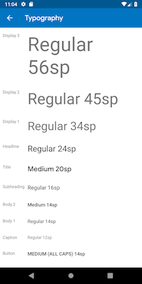
Android 上的 Roboto
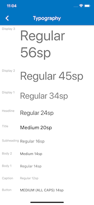
iOS 上的 San Francisco
圖示設計(Iconography)
#當使用 Material 套件時, 部分圖示會依據平台自動顯示不同圖形。 例如,溢出選單按鈕的三個點在 iOS 上是水平排列, 在 Android 上則是垂直排列。 返回按鈕在 iOS 上是簡單的山形符號(chevron), 在 Android 上則有桿身(stem/shaft)。

Android 上的圖示

iOS 上的圖示
Material 函式庫也透過 Icons.adaptive
提供一組平台適應性圖示。
觸覺回饋(Haptic feedback)
#Material 與 Cupertino 套件會在 特定情境下自動觸發符合平台的觸覺回饋。
例如, 在文字欄位長按選字時, Android 會有「嗡嗡」震動,iOS 則沒有。
在 iOS 上捲動選擇器(picker)項目時會有 「輕敲」的觸覺回饋,Android 則無回饋。
文字編輯
#Material 與 Cupertino 的文字輸入欄位 皆支援拼字檢查,並會依平台調整 拼字檢查設定、拼字選單與高亮顏色。
Flutter 也會在編輯文字欄位內容時, 根據當前平台進行下列調適。
鍵盤手勢導覽
#在 Android 上, 可在軟體鍵盤的 space 鍵上左右滑動 以移動 Material 與 Cupertino 文字欄位的游標。
在具備 3D Touch 功能的 iOS 裝置上, 可在軟體鍵盤上用重壓拖曳手勢, 以浮動游標在二維空間移動游標。 此功能同時適用於 Material 與 Cupertino 文字欄位。

Android 空白鍵游標移動

iOS 3D Touch 拖曳游標移動
文字選取工具列
#在 Android 上使用 Material 時, 於文字欄位選取文字時會顯示 Android 風格的選取工具列。
在 iOS 上使用 Material 或使用 Cupertino 時, 於文字欄位選取文字時會顯示 iOS 風格的選取工具列。
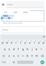
Android 文字選取工具列
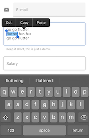
iOS 文字選取工具列
單點擊手勢
#在 Android 上使用 Material 時, 於文字欄位單點會將游標移至點擊位置。
當文字選取為收合狀態時,也會顯示可拖曳的 控制柄以移動游標。
在 iOS 上使用 Material 或使用 Cupertino 時, 於文字欄位單點會將游標移至所點單字的最近邊緣。
iOS 上收合狀態的文字選取不會有可拖曳的控制柄。

Android 點擊

iOS 點擊
長按手勢
#在 Android 上使用 Material 時, 長按會選取長按下的單字。 放開時會顯示選取工具列。
在 iOS 上使用 Material 或使用 Cupertino 時, 長按會將游標移至長按位置。 放開時會顯示選取工具列。

Android 長按

iOS 長按
長按拖曳手勢
#在 Android 上使用 Material 時, 長按後拖曳會擴展所選取的單字範圍。
在 iOS 上使用 Material 或使用 Cupertino 時, 長按後拖曳會移動游標。

Android 長按拖曳

iOS 長按拖曳
雙擊手勢
#在 Android 與 iOS 上, 雙擊會選取接收雙擊的單字, 並顯示選取工具列。

Android 雙擊

iOS 雙擊
UI 元件
#本節提供初步建議,說明如何調適 Material 元件 (Widget), 以在 iOS 上提供自然且吸引人的使用體驗。 歡迎在 issue #8427 提供回饋。
具備 .adaptive() 建構函式的元件
#
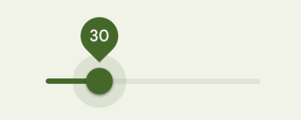
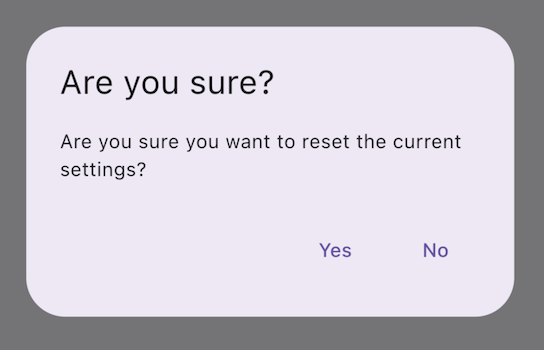
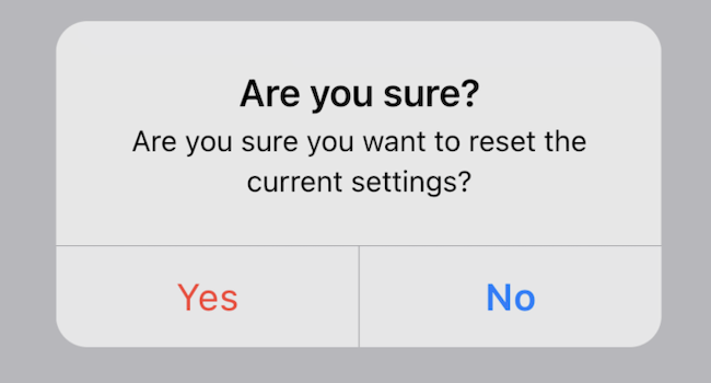
多個元件支援 .adaptive() 建構函式。
下表列出這些元件。
當應用程式在 iOS 裝置上執行時,
適應性建構函式會替換為對應的 Cupertino 元件。
下表中的元件主要用於輸入、選取,以及顯示系統資訊。 由於這些控制項與作業系統緊密整合, 使用者已習慣辨識並回應這些控制項。 因此,我們建議遵循各平台的慣例。
| Material 元件 | Cupertino 元件 | 適應性建構函式 |
|---|---|---|

Switch
|

CupertinoSwitch
|
Switch.adaptive()
|
Slider
|

CupertinoSlider
|
Slider.adaptive()
|

CircularProgressIndicator
|

CupertinoActivityIndicator
|
CircularProgressIndicator.adaptive()
|

RefreshProgressIndicator
|

CupertinoActivityIndicator
|
RefreshIndicator.adaptive()
|

Checkbox
|

CupertinoCheckbox
|
Checkbox.adaptive()
|

Radio
|

CupertinoRadio
|
Radio.adaptive()
|
AlertDialog
|
CupertinoAlertDialog
|
AlertDialog.adaptive()
|
頂部應用程式列與導覽列
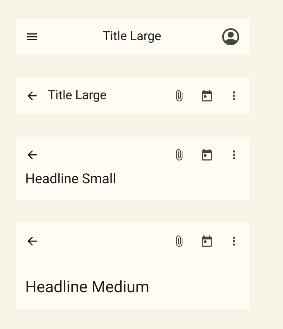
#自 Android 12 起,頂部應用程式列的預設 UI 遵循 Material 3 所定義的設計指引。 在 iOS 上,對應的元件稱為「導覽列(Navigation Bars)」, 其設計定義於 Apple 的人機介面指引(Human Interface Guidelines) (HIG)。
Material 3 中的頂部應用程式列
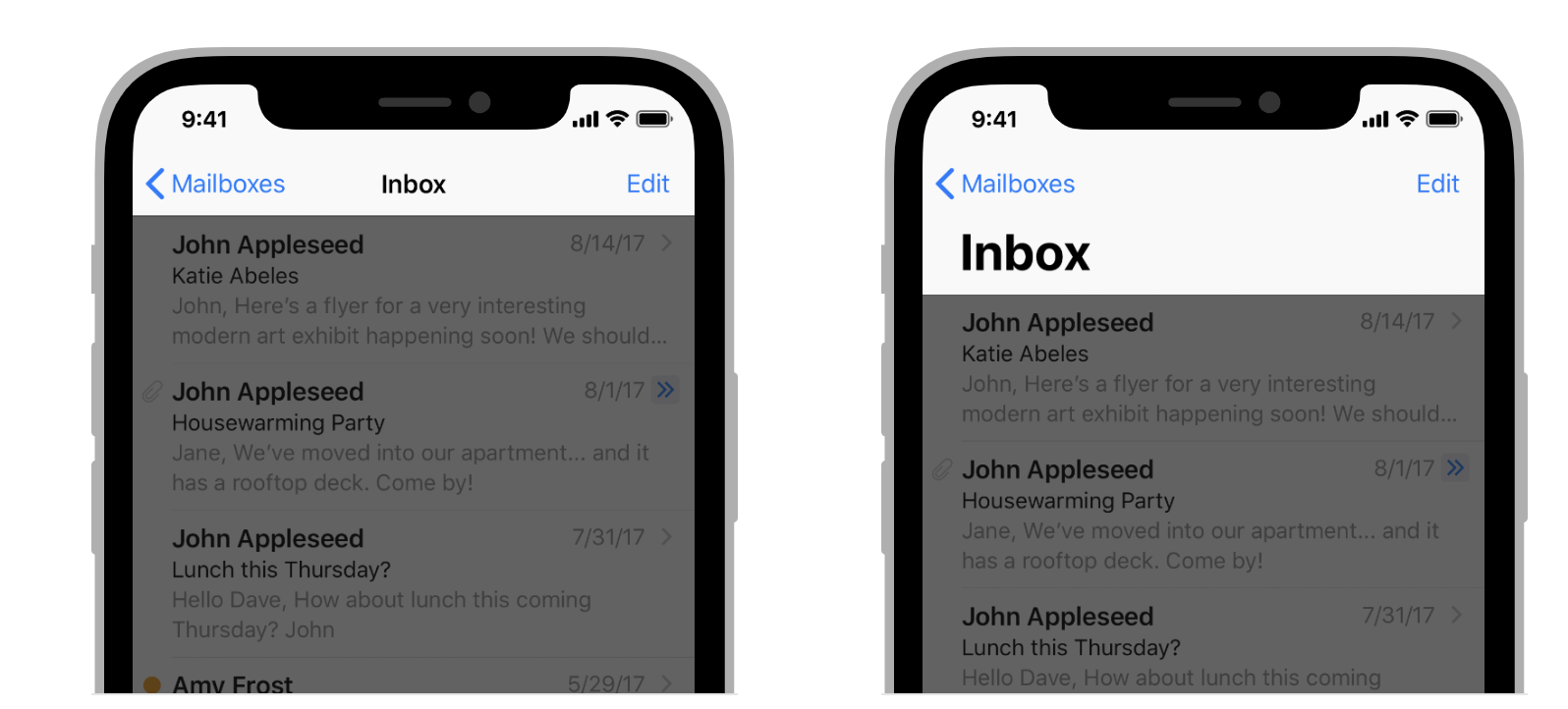
人機介面指引中的導覽列
Flutter 應用程式中應用程式列的某些屬性需要調適,
例如系統圖示與頁面轉場。
使用 Material 的 AppBar 與 SliverAppBar 元件時,
這些屬性已會自動調適。
你也可以進一步自訂這些元件的屬性,
以更貼近 iOS 平台風格,如下所示。
// Map the text theme to iOS styles
TextTheme cupertinoTextTheme = TextTheme(
headlineMedium: CupertinoThemeData()
.textTheme
.navLargeTitleTextStyle
// fixes a small bug with spacing
.copyWith(letterSpacing: -1.5),
titleLarge: CupertinoThemeData().textTheme.navTitleTextStyle)
...
// Use iOS text theme on iOS devices
ThemeData(
textTheme: Platform.isIOS ? cupertinoTextTheme : null,
...
)
...
// Modify AppBar properties
AppBar(
surfaceTintColor: Platform.isIOS ? Colors.transparent : null,
shadowColor: Platform.isIOS ? CupertinoColors.darkBackgroundGray : null,
scrolledUnderElevation: Platform.isIOS ? .1 : null,
toolbarHeight: Platform.isIOS ? 44 : null,
...
),
不過,由於應用程式列會與頁面中的其他內容一起顯示, 建議僅在與應用程式整體風格一致的情況下調整其樣式。 你可以在 GitHub 討論區關於應用程式列調適的討論 中, 查看更多程式碼範例與進一步說明。
底部導覽列
#自 Android 12 起,底部導覽列的預設 UI 遵循 Material 3 所定義的設計指引。 在 iOS 上,對應的元件稱為「Tab Bars(分頁列)」, 其設計定義於 Apple 的人機介面指引(Human Interface Guidelines) (HIG)。
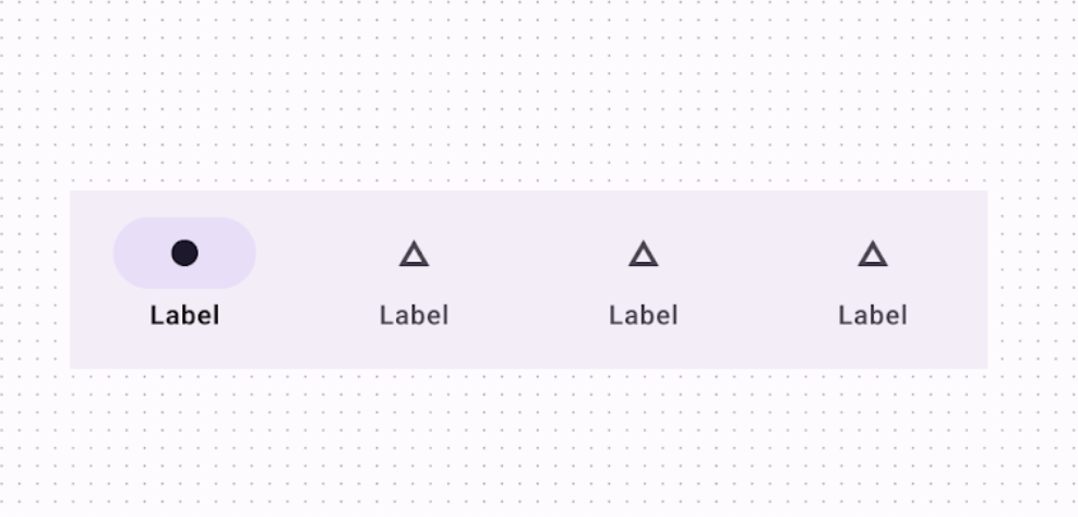
Material 3 的底部導覽列
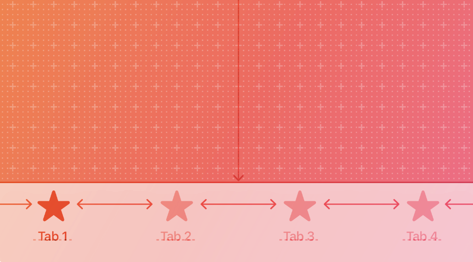
人機介面指引中的 Tab Bar
由於分頁列會在應用程式中持續顯示, 因此應該與你的品牌風格相符。 不過,如果你選擇在 Android 上使用 Material 的預設樣式, 也可以考慮在 iOS 上採用預設的分頁列樣式。
若要實作平台特定的底部導覽列,
你可以在 Android 上使用 Flutter 的 NavigationBar 元件,
在 iOS 上則使用 CupertinoTabBar 元件。
以下是一段你可以參考並調整的程式碼片段,
用於顯示平台特定的導覽列。
final Map<String, Icon> _navigationItems = {
'Menu': Platform.isIOS ? Icon(CupertinoIcons.house_fill) : Icon(Icons.home),
'Order': Icon(Icons.adaptive.share),
};
...
Scaffold(
body: _currentWidget,
bottomNavigationBar: Platform.isIOS
? CupertinoTabBar(
currentIndex: _currentIndex,
onTap: (index) {
setState(() => _currentIndex = index);
_loadScreen();
},
items: _navigationItems.entries
.map<BottomNavigationBarItem>(
(entry) => BottomNavigationBarItem(
icon: entry.value,
label: entry.key,
))
.toList(),
)
: NavigationBar(
selectedIndex: _currentIndex,
onDestinationSelected: (index) {
setState(() => _currentIndex = index);
_loadScreen();
},
destinations: _navigationItems.entries
.map<Widget>((entry) => NavigationDestination(
icon: entry.value,
label: entry.key,
))
.toList(),
));
文字欄位
#自 Android 12 起,文字欄位遵循 Material 3 (M3) 設計指引。 在 iOS 上,Apple 的人機介面指引(Human Interface Guidelines) (HIG) 則定義了對應的元件。
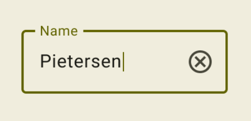
Material 3 中的文字欄位

HIG 中的文字欄位
由於文字欄位需要使用者輸入, 其設計應遵循各平台的慣例。
若要在 Flutter 中實作平台專屬的 TextField,
可以調整 Material TextField 的樣式來達成。
Widget _createAdaptiveTextField() {
final _border = OutlineInputBorder(
borderSide: BorderSide(color: CupertinoColors.lightBackgroundGray),
);
final iOSDecoration = InputDecoration(
border: _border,
enabledBorder: _border,
focusedBorder: _border,
filled: true,
fillColor: CupertinoColors.white,
hoverColor: CupertinoColors.white,
contentPadding: EdgeInsets.fromLTRB(10, 0, 0, 0),
);
return Platform.isIOS
? SizedBox(
height: 36.0,
child: TextField(
decoration: iOSDecoration,
),
)
: TextField();
}
想進一步了解如何調整文字欄位,請參閱 GitHub 上關於文字欄位的討論。 你可以在該討論中留下回饋或提出問題。
Unless stated otherwise, the documentation on this site reflects Flutter 3.44.0. Page last updated on 2026-06-14. View source or report an issue.