使用主題 (Themes) 來共用顏色與字型樣式
如何使用主題 (Themes) 在整個應用程式中共用顏色與字型樣式。
若要在整個應用程式中共用顏色與字型樣式,請使用主題 (Themes)。
你可以定義全域的應用程式主題。 你也可以擴充主題,針對單一元件 (Widget) 修改主題樣式。 每個主題會定義顏色、字型樣式及其他適用於各種 Material 元件的參數。
Flutter 會依照以下順序套用樣式:
- 套用於特定元件 (Widget) 的樣式。
- 覆寫最近父主題的主題。
- 整個應用程式的主要主題。
定義好 Theme 之後,可以在你自己的元件 (Widget) 中使用它。
Flutter 的 Material 元件會根據你的主題設定
應用程式列、按鈕、核取方塊等的背景顏色與字型樣式。
建立應用程式主題
#
若要在整個應用程式中共用 Theme,請將 theme 屬性
設為你的 MaterialApp 建構函式。
此屬性需要一個 ThemeData
實例。
如果你沒有在建構函式中指定主題, Flutter 會自動為你建立一個預設主題。
MaterialApp(
title: appName,
theme: ThemeData(
// Define the default brightness and colors.
colorScheme: ColorScheme.fromSeed(
seedColor: Colors.purple,
// ···
brightness: Brightness.dark,
),
// Define the default `TextTheme`. Use this to specify the default
// text styling for headlines, titles, bodies of text, and more.
textTheme: TextTheme(
displayLarge: const TextStyle(
fontSize: 72,
fontWeight: FontWeight.bold,
),
// ···
titleLarge: GoogleFonts.oswald(
fontSize: 30,
fontStyle: FontStyle.italic,
),
bodyMedium: GoogleFonts.merriweather(),
displaySmall: GoogleFonts.pacifico(),
),
),
home: const MyHomePage(title: appName),
);
大多數 ThemeData 實例會設定以下兩個屬性的值。這些屬性會影響整個應用程式。
-
colorScheme定義顏色。 -
textTheme定義文字樣式。
若想了解可以定義哪些顏色、字型及其他屬性,
請參閱 ThemeData
文件。
套用主題
#
要套用新的主題,請在指定元件 (Widget) 樣式屬性時,
使用 Theme.of(context) 方法。
這些屬性可以包含(但不限於)style 和 color。
Theme.of(context) 方法會向上查找元件樹,並取得
樹中最近的 Theme。
如果你有獨立的 Theme,則會套用該主題。
否則,Flutter 會套用應用程式的主題。
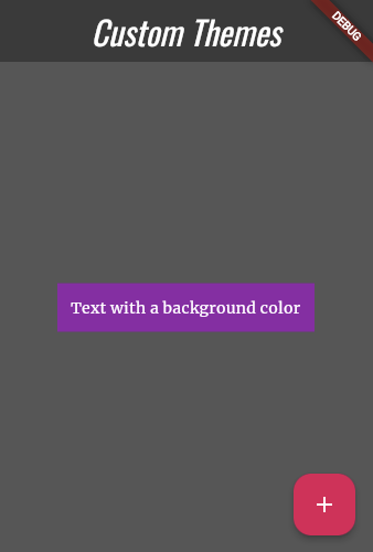
在下方範例中,Container 建構函式利用這個技巧來設定其 color。
Container(
  padding: const EdgeInsets.symmetric(horizontal: 12, vertical: 12),
  color: Theme.of(context).colorScheme.primary,
  child: Text(
    'Text with a background color',
    // ···
    style: Theme.of(context).textTheme.bodyMedium!.copyWith(
      color: Theme.of(context).colorScheme.onPrimary,
    ),
  ),
),
覆寫主題
#
若要在應用程式的某個區域覆寫整體主題,
請將該區域包裹在 Theme 元件 (Widget) 中。
你可以用兩種方式覆寫主題:
- 建立一個獨特的
ThemeData實例。 - 延伸(extend)父主題。
設定獨特的 ThemeData 實例
#
如果你希望應用程式中的某個元件忽略整體主題,
可以建立一個 ThemeData 實例。
並將該實例傳遞給 Theme 元件 (Widget)。
Theme(
  // Create a unique theme with `ThemeData`.
  data: ThemeData(colorScheme: ColorScheme.fromSeed(seedColor: Colors.pink)),
  child: FloatingActionButton(onPressed: () {}, child: const Icon(Icons.add)),
);
延伸父主題
#
與其覆寫所有內容,不如考慮延伸父主題(parent theme)。
要延伸主題,請使用 copyWith()
方法。
Theme(
  // Find and extend the parent theme using `copyWith`.
  // To learn more, check out the section on `Theme.of`.
  data: Theme.of(
    context,
  ).copyWith(colorScheme: ColorScheme.fromSeed(seedColor: Colors.pink)),
  child: const FloatingActionButton(onPressed: null, child: Icon(Icons.add)),
);
觀看有關 Theme 的影片
#
想進一步了解,請觀看這段介紹 Theme 元件 (Widget) 的 Widget of the Week 精選短片:
試用互動範例
#import 'package:flutter/material.dart';
// Include the Google Fonts package to provide more text format options
// https://pub.dev/packages/google_fonts
import 'package:google_fonts/google_fonts.dart';
void main() {
runApp(const MyApp());
}
class MyApp extends StatelessWidget {
const MyApp({super.key});
@override
Widget build(BuildContext context) {
const appName = 'Custom Themes';
return MaterialApp(
title: appName,
theme: ThemeData(
// Define the default brightness and colors.
colorScheme: ColorScheme.fromSeed(
seedColor: Colors.purple,
// TRY THIS: Change to "Brightness.light"
// and see that all colors change
// to better contrast a light background.
brightness: Brightness.dark,
),
// Define the default `TextTheme`. Use this to specify the default
// text styling for headlines, titles, bodies of text, and more.
textTheme: TextTheme(
displayLarge: const TextStyle(
fontSize: 72,
fontWeight: FontWeight.bold,
),
// TRY THIS: Change one of the GoogleFonts
// to "lato", "poppins", or "lora".
// The title uses "titleLarge"
// and the middle text uses "bodyMedium".
titleLarge: GoogleFonts.oswald(
fontSize: 30,
fontStyle: FontStyle.italic,
),
bodyMedium: GoogleFonts.merriweather(),
displaySmall: GoogleFonts.pacifico(),
),
),
home: const MyHomePage(title: appName),
);
}
}
class MyHomePage extends StatelessWidget {
final String title;
const MyHomePage({super.key, required this.title});
@override
Widget build(BuildContext context) {
return Scaffold(
appBar: AppBar(
title: Text(
title,
style: Theme.of(context).textTheme.titleLarge!.copyWith(
color: Theme.of(context).colorScheme.onSecondary,
),
),
backgroundColor: Theme.of(context).colorScheme.secondary,
),
body: Center(
child: Container(
padding: const EdgeInsets.symmetric(horizontal: 12, vertical: 12),
color: Theme.of(context).colorScheme.primary,
child: Text(
'Text with a background color',
// TRY THIS: Change the Text value
// or change the Theme.of(context).textTheme
// to "displayLarge" or "displaySmall".
style: Theme.of(context).textTheme.bodyMedium!.copyWith(
color: Theme.of(context).colorScheme.onPrimary,
),
),
),
),
floatingActionButton: Theme(
data: Theme.of(context).copyWith(
// TRY THIS: Change the seedColor to "Colors.red" or
// "Colors.blue".
colorScheme: ColorScheme.fromSeed(
seedColor: Colors.pink,
brightness: Brightness.dark,
),
),
child: FloatingActionButton(
onPressed: () {},
child: const Icon(Icons.add),
),
),
);
}
}
Unless stated otherwise, the documentation on this site reflects Flutter 3.44.0. Page last updated on 2026-06-14. View source or report an issue.