建立階梯式選單動畫
如何實作階梯式選單動畫。
一個單一的應用程式螢幕可能包含多個動畫(Animation)。 如果同時播放所有動畫,畫面會顯得過於繁雜;而若一個接一個依序播放,則可能花費太多時間。更好的做法是採用階梯式(staggered)動畫:每個動畫在不同的時間點開始,但動畫彼此重疊,總體持續時間較短。 在本教學中,你將建立一個帶有階梯式動畫內容的抽屜選單(drawer menu),並在底部加入一個彈出(pop-in)按鈕。
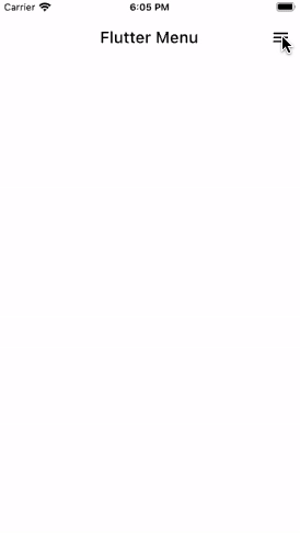
下方動畫展示了應用程式的行為:
建立未加入動畫的選單
#抽屜選單會顯示一個標題清單,並在選單底部顯示一個「Get started」按鈕。
請定義一個名為 Menu 的 StatefulWidget(有狀態元件),用於在固定位置顯示清單與按鈕。
class Menu extends StatefulWidget {
const Menu({super.key});
@override
State<Menu> createState() => _MenuState();
}
class _MenuState extends State<Menu> {
static const _menuTitles = [
'Declarative Style',
'Premade Widgets',
'Stateful Hot Reload',
'Native Performance',
'Great Community',
];
@override
Widget build(BuildContext context) {
return Container(
color: Colors.white,
child: Stack(
fit: StackFit.expand,
children: [_buildFlutterLogo(), _buildContent()],
),
);
}
Widget _buildFlutterLogo() {
// TODO: We'll implement this later.
return Container();
}
Widget _buildContent() {
return Column(
crossAxisAlignment: CrossAxisAlignment.start,
children: [
const SizedBox(height: 16),
..._buildListItems(),
const Spacer(),
_buildGetStartedButton(),
],
);
}
List<Widget> _buildListItems() {
final listItems = <Widget>[];
for (var i = 0; i < _menuTitles.length; ++i) {
listItems.add(
Padding(
padding: const EdgeInsets.symmetric(horizontal: 36, vertical: 16),
child: Text(
_menuTitles[i],
textAlign: TextAlign.left,
style: const TextStyle(fontSize: 24, fontWeight: FontWeight.w500),
),
),
);
}
return listItems;
}
Widget _buildGetStartedButton() {
return SizedBox(
width: double.infinity,
child: Padding(
padding: const EdgeInsets.all(24),
child: ElevatedButton(
style: ElevatedButton.styleFrom(
shape: const StadiumBorder(),
backgroundColor: Colors.blue,
padding: const EdgeInsets.symmetric(horizontal: 48, vertical: 14),
),
onPressed: () {},
child: const Text(
'Get Started',
style: TextStyle(color: Colors.white, fontSize: 22),
),
),
),
);
}
}
準備動畫 (Prepare for animations)
#要控制動畫 (Animation) 的時序,需要一個 AnimationController。
將 SingleTickerProviderStateMixin 新增到 MenuState 類別中。然後,宣告並實例化一個 AnimationController。
class _MenuState extends State<Menu> with SingleTickerProviderStateMixin {
late AnimationController _staggeredController;
@override
void initState() {
super.initState();
_staggeredController = AnimationController(vsync: this);
}
@override
void dispose() {
_staggeredController.dispose();
super.dispose();
}
}
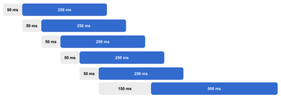
每個動畫開始前的延遲時間長短取決於你的需求。你可以自訂動畫的延遲時間、各自的動畫持續時間,以及整體動畫的總持續時間。
class _MenuState extends State<Menu> with SingleTickerProviderStateMixin {
  static const _initialDelayTime = Duration(milliseconds: 50);
  static const _itemSlideTime = Duration(milliseconds: 250);
  static const _staggerTime = Duration(milliseconds: 50);
  static const _buttonDelayTime = Duration(milliseconds: 150);
  static const _buttonTime = Duration(milliseconds: 500);
  final Duration _animationDuration =
      _initialDelayTime +
      (_staggerTime * _menuTitles.length) +
      _buttonDelayTime +
      _buttonTime;
}
在這個範例中,所有動畫都會延遲 50 毫秒後才開始。 接著,清單項目會依序出現。 每個清單項目的出現,會在前一個清單項目開始滑入後延遲 50 毫秒。 每個清單項目從右側滑入到左側所需的時間為 250 毫秒。 當最後一個清單項目開始滑入後, 底部的按鈕會再等待 150 毫秒才彈出。 按鈕的動畫時間為 500 毫秒。
在定義好每個延遲與動畫持續時間後, 會計算總動畫時間,這樣就能用來 計算各個動畫的起止時間。
下圖顯示了預期的動畫時序:
若要在一個較長動畫的子區段內對某個值進行動畫,
Flutter 提供了 Interval 類別。
Interval 需要傳入起始時間百分比與結束時間百分比。
然後可以使用該 Interval,
在指定的起始與結束時間之間對值進行動畫,
而不是使用整個動畫的起始與結束時間。例如,假設一個動畫總長為 1 秒,
若設定區間為 0.2 到 0.5,則會從 200 毫秒(20%)開始,
在 500 毫秒(50%)結束。
宣告並計算每個清單項目的 Interval 以及
底部按鈕的 Interval。
class _MenuState extends State<Menu> with SingleTickerProviderStateMixin {
final List<Interval> _itemSlideIntervals = [];
late Interval _buttonInterval;
@override
void initState() {
super.initState();
_createAnimationIntervals();
_staggeredController = AnimationController(
vsync: this,
duration: _animationDuration,
);
}
void _createAnimationIntervals() {
for (var i = 0; i < _menuTitles.length; ++i) {
final startTime = _initialDelayTime + (_staggerTime * i);
final endTime = startTime + _itemSlideTime;
_itemSlideIntervals.add(
Interval(
startTime.inMilliseconds / _animationDuration.inMilliseconds,
endTime.inMilliseconds / _animationDuration.inMilliseconds,
),
);
}
final buttonStartTime =
Duration(milliseconds: _menuTitles.length * 50) + _buttonDelayTime;
final buttonEndTime = buttonStartTime + _buttonTime;
_buttonInterval = Interval(
buttonStartTime.inMilliseconds / _animationDuration.inMilliseconds,
buttonEndTime.inMilliseconds / _animationDuration.inMilliseconds,
);
}
}
為清單項目與按鈕加入動畫
#當選單變為可見時,會立即播放階層式(staggered)動畫。
在 initState() 中啟動動畫。
@override
void initState() {
super.initState();
_createAnimationIntervals();
_staggeredController = AnimationController(
vsync: this,
duration: _animationDuration,
)..forward();
}
每個清單項目會從右側滑入至左側,並同時淡入顯示。
使用清單項目的 Interval 以及 easeOut 曲線,為每個清單項目的透明度與平移值添加動畫效果。
List<Widget> _buildListItems() {
final listItems = <Widget>[];
for (var i = 0; i < _menuTitles.length; ++i) {
listItems.add(
AnimatedBuilder(
animation: _staggeredController,
builder: (context, child) {
final animationPercent = Curves.easeOut.transform(
_itemSlideIntervals[i].transform(_staggeredController.value),
);
final opacity = animationPercent;
final slideDistance = (1.0 - animationPercent) * 150;
return Opacity(
opacity: opacity,
child: Transform.translate(
offset: Offset(slideDistance, 0),
child: child,
),
);
},
child: Padding(
padding: const EdgeInsets.symmetric(horizontal: 36, vertical: 16),
child: Text(
_menuTitles[i],
textAlign: TextAlign.left,
style: const TextStyle(fontSize: 24, fontWeight: FontWeight.w500),
),
),
),
);
}
return listItems;
}
使用相同的方法來為底部按鈕的透明度(opacity)和縮放(scale)製作動畫。這次,請使用 elasticOut 曲線,讓按鈕呈現彈跳(springy)的效果。
Widget _buildGetStartedButton() {
return SizedBox(
width: double.infinity,
child: Padding(
padding: const EdgeInsets.all(24),
child: AnimatedBuilder(
animation: _staggeredController,
builder: (context, child) {
final animationPercent = Curves.elasticOut.transform(
_buttonInterval.transform(_staggeredController.value),
);
final opacity = animationPercent.clamp(0.0, 1.0);
final scale = (animationPercent * 0.5) + 0.5;
return Opacity(
opacity: opacity,
child: Transform.scale(scale: scale, child: child),
);
},
child: ElevatedButton(
style: ElevatedButton.styleFrom(
shape: const StadiumBorder(),
backgroundColor: Colors.blue,
padding: const EdgeInsets.symmetric(horizontal: 48, vertical: 14),
),
onPressed: () {},
child: const Text(
'Get Started',
style: TextStyle(color: Colors.white, fontSize: 22),
),
),
),
),
);
}
恭喜你! 你已經完成了一個帶有動畫效果的選單,每個 清單項目的出現都有間隔,接著底部的按鈕 會以彈出的方式顯示。
互動範例
#import 'package:flutter/material.dart';
void main() {
runApp(
const MaterialApp(
home: ExampleStaggeredAnimations(),
debugShowCheckedModeBanner: false,
),
);
}
class ExampleStaggeredAnimations extends StatefulWidget {
const ExampleStaggeredAnimations({super.key});
@override
State<ExampleStaggeredAnimations> createState() =>
_ExampleStaggeredAnimationsState();
}
class _ExampleStaggeredAnimationsState extends State<ExampleStaggeredAnimations>
with SingleTickerProviderStateMixin {
late AnimationController _drawerSlideController;
@override
void initState() {
super.initState();
_drawerSlideController = AnimationController(
vsync: this,
duration: const Duration(milliseconds: 150),
);
}
@override
void dispose() {
_drawerSlideController.dispose();
super.dispose();
}
bool _isDrawerOpen() {
return _drawerSlideController.value == 1.0;
}
bool _isDrawerOpening() {
return _drawerSlideController.status == AnimationStatus.forward;
}
bool _isDrawerClosed() {
return _drawerSlideController.value == 0.0;
}
void _toggleDrawer() {
if (_isDrawerOpen() || _isDrawerOpening()) {
_drawerSlideController.reverse();
} else {
_drawerSlideController.forward();
}
}
@override
Widget build(BuildContext context) {
return Scaffold(
backgroundColor: Colors.white,
appBar: _buildAppBar(),
body: Stack(children: [_buildContent(), _buildDrawer()]),
);
}
PreferredSizeWidget _buildAppBar() {
return AppBar(
title: const Text('Flutter Menu', style: TextStyle(color: Colors.black)),
backgroundColor: Colors.transparent,
elevation: 0.0,
automaticallyImplyLeading: false,
actions: [
AnimatedBuilder(
animation: _drawerSlideController,
builder: (context, child) {
return IconButton(
onPressed: _toggleDrawer,
icon: _isDrawerOpen() || _isDrawerOpening()
? const Icon(Icons.clear, color: Colors.black)
: const Icon(Icons.menu, color: Colors.black),
);
},
),
],
);
}
Widget _buildContent() {
// Put page content here.
return const SizedBox();
}
Widget _buildDrawer() {
return AnimatedBuilder(
animation: _drawerSlideController,
builder: (context, child) {
return FractionalTranslation(
translation: Offset(1.0 - _drawerSlideController.value, 0.0),
child: _isDrawerClosed() ? const SizedBox() : const Menu(),
);
},
);
}
}
class Menu extends StatefulWidget {
const Menu({super.key});
@override
State<Menu> createState() => _MenuState();
}
class _MenuState extends State<Menu> with SingleTickerProviderStateMixin {
static const _menuTitles = [
'Declarative style',
'Premade widgets',
'Stateful hot reload',
'Native performance',
'Great community',
];
static const _initialDelayTime = Duration(milliseconds: 50);
static const _itemSlideTime = Duration(milliseconds: 250);
static const _staggerTime = Duration(milliseconds: 50);
static const _buttonDelayTime = Duration(milliseconds: 150);
static const _buttonTime = Duration(milliseconds: 500);
final Duration _animationDuration =
_initialDelayTime +
(_staggerTime * _menuTitles.length) +
_buttonDelayTime +
_buttonTime;
late AnimationController _staggeredController;
final List<Interval> _itemSlideIntervals = [];
late Interval _buttonInterval;
@override
void initState() {
super.initState();
_createAnimationIntervals();
_staggeredController = AnimationController(
vsync: this,
duration: _animationDuration,
)..forward();
}
void _createAnimationIntervals() {
for (var i = 0; i < _menuTitles.length; ++i) {
final startTime = _initialDelayTime + (_staggerTime * i);
final endTime = startTime + _itemSlideTime;
_itemSlideIntervals.add(
Interval(
startTime.inMilliseconds / _animationDuration.inMilliseconds,
endTime.inMilliseconds / _animationDuration.inMilliseconds,
),
);
}
final buttonStartTime =
Duration(milliseconds: _menuTitles.length * 50) + _buttonDelayTime;
final buttonEndTime = buttonStartTime + _buttonTime;
_buttonInterval = Interval(
buttonStartTime.inMilliseconds / _animationDuration.inMilliseconds,
buttonEndTime.inMilliseconds / _animationDuration.inMilliseconds,
);
}
@override
void dispose() {
_staggeredController.dispose();
super.dispose();
}
@override
Widget build(BuildContext context) {
return Container(
color: Colors.white,
child: Stack(
fit: StackFit.expand,
children: [_buildFlutterLogo(), _buildContent()],
),
);
}
Widget _buildFlutterLogo() {
return const Positioned(
right: -100,
bottom: -30,
child: Opacity(opacity: 0.2, child: FlutterLogo(size: 400)),
);
}
Widget _buildContent() {
return Column(
crossAxisAlignment: CrossAxisAlignment.start,
children: [
const SizedBox(height: 16),
..._buildListItems(),
const Spacer(),
_buildGetStartedButton(),
],
);
}
List<Widget> _buildListItems() {
final listItems = <Widget>[];
for (var i = 0; i < _menuTitles.length; ++i) {
listItems.add(
AnimatedBuilder(
animation: _staggeredController,
builder: (context, child) {
final animationPercent = Curves.easeOut.transform(
_itemSlideIntervals[i].transform(_staggeredController.value),
);
final opacity = animationPercent;
final slideDistance = (1.0 - animationPercent) * 150;
return Opacity(
opacity: opacity,
child: Transform.translate(
offset: Offset(slideDistance, 0),
child: child,
),
);
},
child: Padding(
padding: const EdgeInsets.symmetric(horizontal: 36, vertical: 16),
child: Text(
_menuTitles[i],
textAlign: TextAlign.left,
style: const TextStyle(fontSize: 24, fontWeight: FontWeight.w500),
),
),
),
);
}
return listItems;
}
Widget _buildGetStartedButton() {
return SizedBox(
width: double.infinity,
child: Padding(
padding: const EdgeInsets.all(24),
child: AnimatedBuilder(
animation: _staggeredController,
builder: (context, child) {
final animationPercent = Curves.elasticOut.transform(
_buttonInterval.transform(_staggeredController.value),
);
final opacity = animationPercent.clamp(0.0, 1.0);
final scale = (animationPercent * 0.5) + 0.5;
return Opacity(
opacity: opacity,
child: Transform.scale(scale: scale, child: child),
);
},
child: ElevatedButton(
style: ElevatedButton.styleFrom(
shape: const StadiumBorder(),
backgroundColor: Colors.blue,
padding: const EdgeInsets.symmetric(horizontal: 48, vertical: 14),
),
onPressed: () {},
child: const Text(
'Get started',
style: TextStyle(color: Colors.white, fontSize: 22),
),
),
),
),
);
}
}Unless stated otherwise, the documentation on this site reflects Flutter 3.44.0. Page last updated on 2026-06-14. View source or report an issue.