Flutter 元件索引
Flutter 元件的字母順序清單。
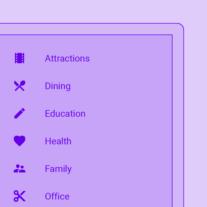
這是 Flutter 內建許多元件 (Widget) 的字母順序清單。 你也可以依分類瀏覽元件。
你可能也想在 Flutter YouTube 頻道上查看我們的「本週元件」系列影片。每集短片介紹一個不同的 Flutter 元件。想了解更多系列影片,請參閱我們的影片頁面。
A widget that absorbs pointers during hit testing. When absorbing is true, this widget prevents its subtree from receiving pointer events by terminating hit testing...
Hovering containers that prompt app users to provide more data or make a decision.
A widget that aligns its child within itself and optionally sizes itself based on the child's size.
Animated version of an Align that animates its Align.alignment property.
Animated transition that moves the child's position over a given duration whenever the given alignment changes.
A general-purpose widget for building animations. AnimatedBuilder is useful for more complex widgets that wish to include animation as part of a larger build function....
A container that gradually changes its values over a period of time.
A widget that cross-fades between two given children and animates itself between their sizes.
Animated version of DefaultTextStyle which automatically transitions the default text style (the text style to apply to descendant Text widgets without explicit style) over a...
A scrolling container that animates items when they are inserted or removed.
The state for a scrolling container that animates items when they are inserted or removed.
A widget that prevents the user from interacting with widgets behind itself.
Animated version of Opacity which automatically transitions the child's opacity over a given duration whenever the given opacity changes.
Animated version of PhysicalModel.
Animated version of Positioned which automatically transitions the child's position over a given duration whenever the given position changes.
Animated version of Transform.scale that automatically transitions the child's scale over a given duration whenever the given scale changes.
Animated widget that automatically transitions its size over a given duration whenever the given child's size changes.
A widget that rebuilds when the given Listenable changes value.
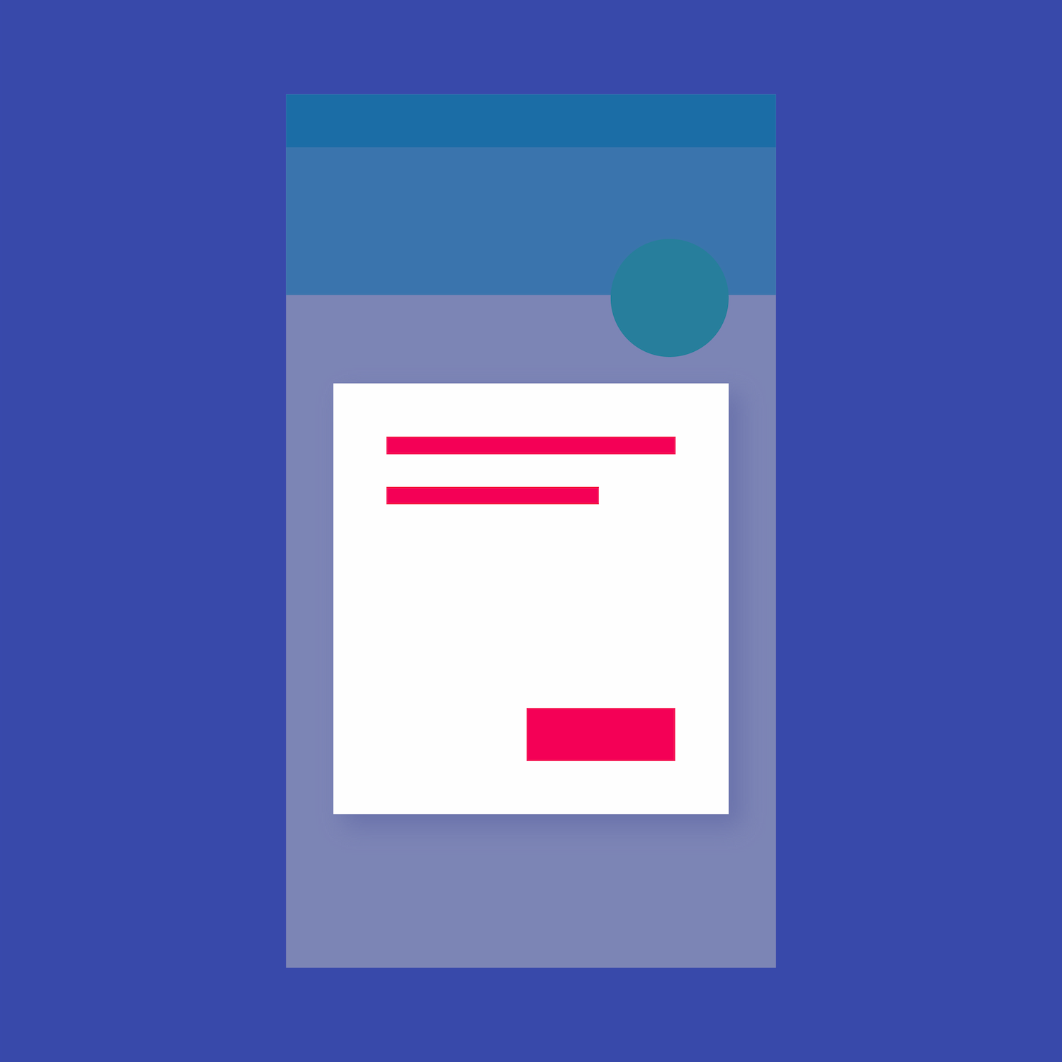
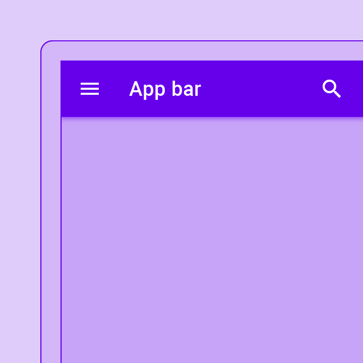
Container that displays content and actions at the top of a screen.
A widget that attempts to size the child to a specific aspect ratio.
Asset bundles contain resources, such as images and strings, that can be used by an application. Access to these resources is asynchronous so that they...
A widget for helping the user make a selection by entering some text and choosing from among a list of options.
A widget that applies a filter to the existing painted content and then paints a child. This effect is relatively expensive, especially if the filter...
Icon-like block that conveys dynamic content such as counts or status. It can include labels or numbers.
Container that positions its child according to the child's baseline.
Container that displays navigation and key actions at the bottom of a screen.
Containers that anchor supplementary content to the bottom of the screen.
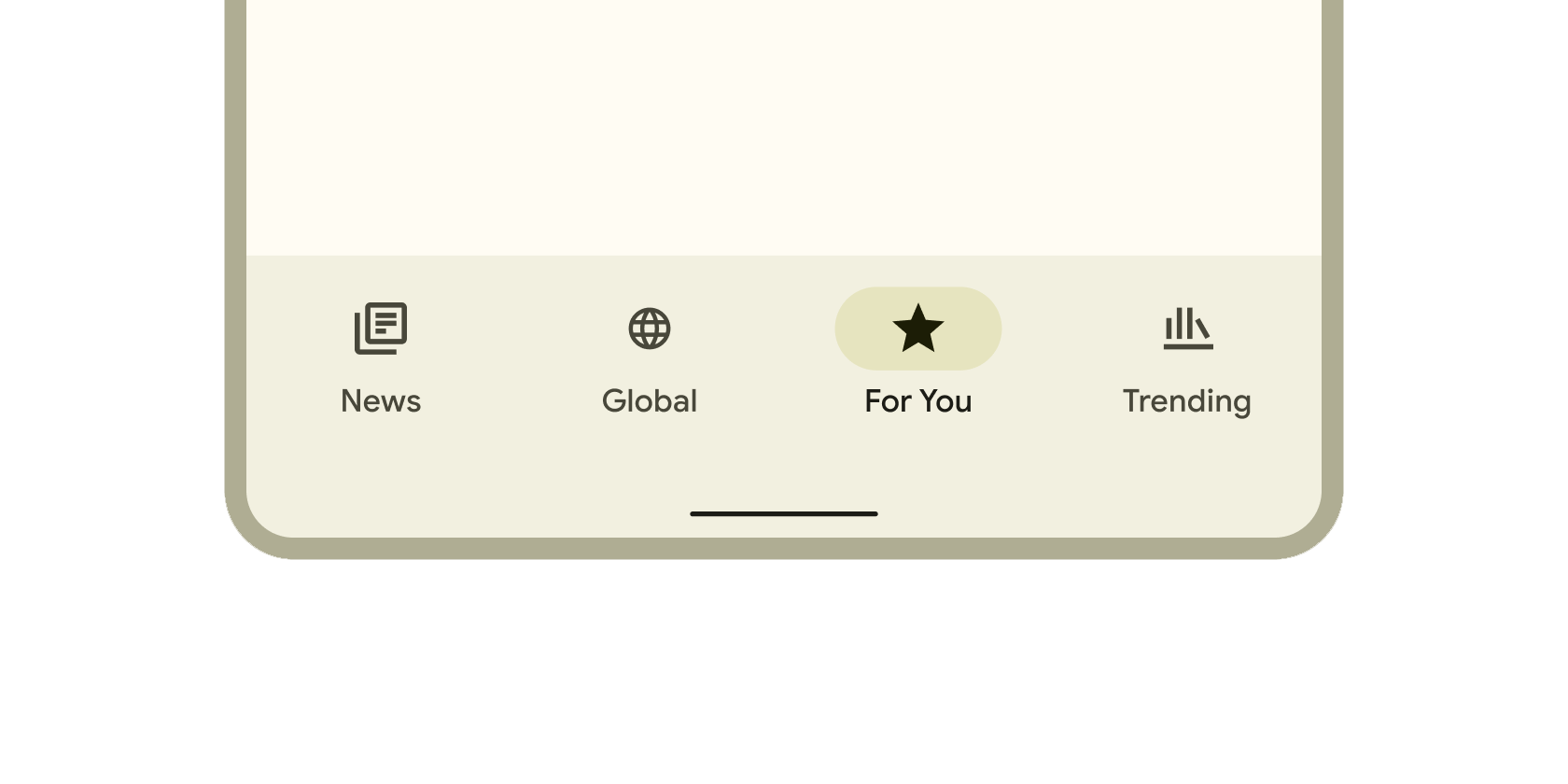
Container that includes tools to explore and switch between top-level views in a single tap.
Container for short, related pieces of content displayed in a box with rounded corners and a drop shadow.
A Material carousel widget that presents a scrollable list of items, each of which can dynamically change size based on the chosen layout.
Alignment block that centers its child within itself.
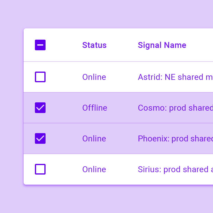
Form control that app users can set or clear to select one or more options from a set.
Small blocks that simplify entering information, making selections, filtering content, or triggering actions.
Circular progress indicator that spins to indicate a busy application.
A widget that clips its child using an oval.
A widget that clips its child using a path.
A widget that clips its child using a rectangle.
Layout a list of child widgets in the vertical direction.
Clickable blocks that start an action, such as sending an email, sharing a document, or liking a comment.
A widget that imposes additional constraints on its child.
A convenience widget that combines common painting, positioning, and sizing widgets.
An iOS-style modal bottom action sheet to choose an option among many.
A button typically used in a CupertinoActionSheet.
An iOS-style activity indicator. Displays a circular 'spinner'.
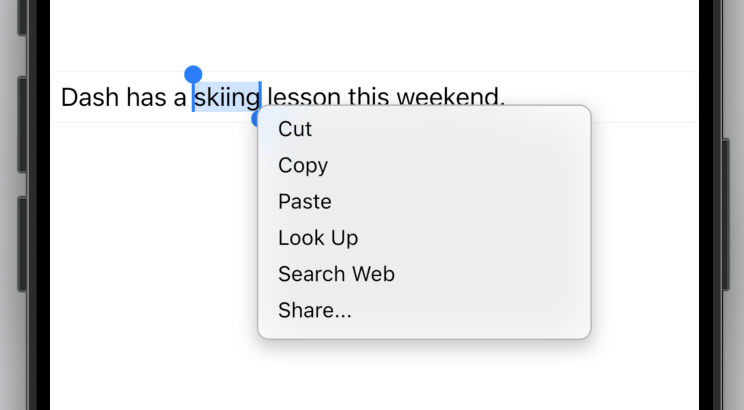
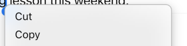
The default Cupertino context menu for text selection for the current platform with the given children.
An iOS-style alert dialog.
An application that uses Cupertino design.
An iOS-style button.
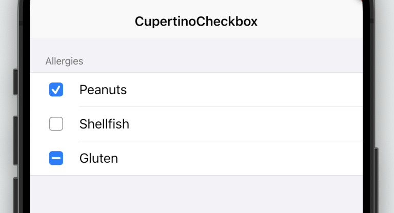
A macOS-style checkbox.
A palette of Color constants that describe colors commonly used when matching the iOS platform aesthetics.
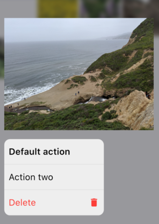
An iOS-style full-screen modal route that opens when the child is long-pressed. Used to display relevant actions for your content.
A button in a ContextMenuSheet.
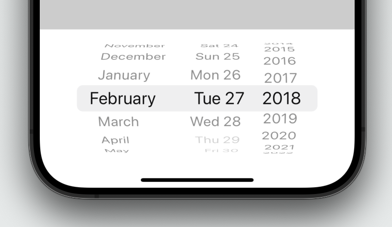
An iOS-style date or date and time picker.
Desktop Cupertino styled text selection controls.
A macOS-style text selection toolbar.
A button in the style of the macOS context menu buttons.
A button typically used in a CupertinoAlertDialog.
A dialog route that shows an iOS-style dialog.
A Color subclass that represents a family of colors, and the correct effective color in the color family.
An iOS-style form row.
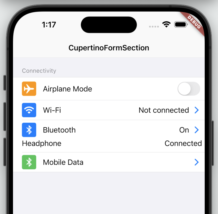
An iOS-style form section.
An iOS-style transition used for summoning fullscreen dialogs.
Container that uses the iOS style to display a scrollable view.
A block that uses the iOS style to create a row in a list.
A typical iOS trailing widget used to denote that a CupertinoListTile is a button with an action.
Defines the localized resource values used by the Cupertino widgets.
A RawMagnifier used for magnifying text in cases where a user's finger may be blocking the point of interest, like a selection handle.
A route that shows a modal iOS-style popup that slides up from the bottom of the screen.
Container at the top of a screen that uses the iOS style. Many developers use this with CupertinoPageScaffold.
A nav bar back button typically used in CupertinoNavigationBar.
A page that creates a cupertino style PageRoute.
A modal route that replaces the entire screen with an iOS transition.
Basic iOS style page layout structure. Positions a navigation bar and content on a background.
Provides an iOS-style page transition animation.
An iOS-style picker control. Used to select an item in a short list.
A default selection overlay for CupertinoPickers.
Rounded rectangle surface that looks like an iOS popup surface, such as an alert dialog or action sheet.
A macOS-style radio button.
Describes how Scrollable widgets behave for CupertinoApps.
An iOS-style scrollbar that indicates which portion of a scrollable widget is currently visible.
An iOS-style search field.
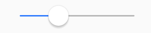
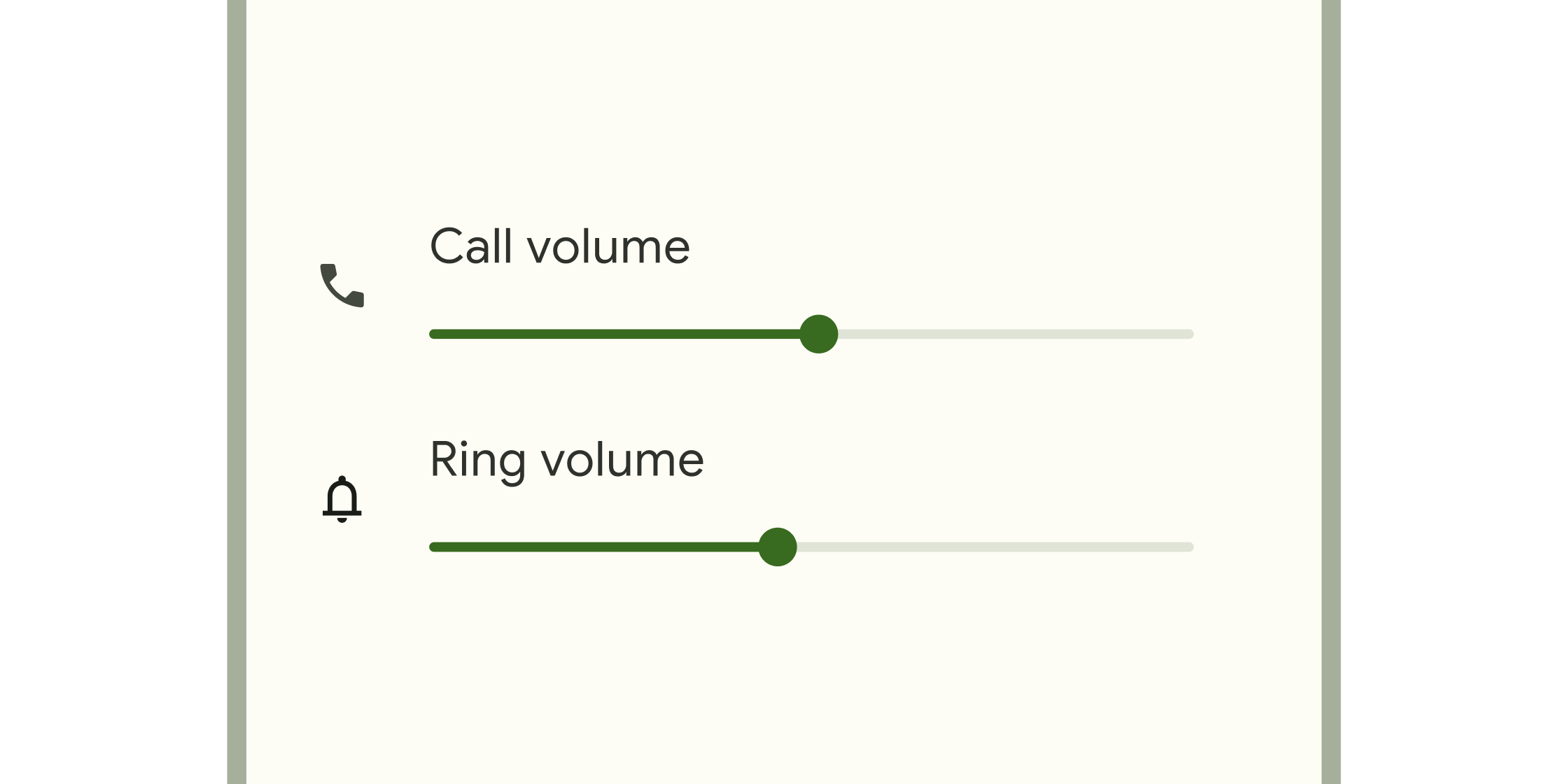
Used to select from a range of values.
An iOS-13-style segmented control. Used to select mutually exclusive options in a horizontal list.
A navigation bar with iOS-11-style large titles using slivers.
A sliver widget implementing the iOS-style pull to refresh content control.
The default spell check suggestions toolbar for iOS.
An iOS-style switch. Used to toggle the on/off state of a single setting.
An iOS-style bottom tab bar. Typically used with CupertinoTabScaffold.
Coordinates tab selection between a CupertinoTabBar and a CupertinoTabScaffold.
Tabbed iOS app structure. Positions a tab bar on top of tabs of content.
Root content of a tab that supports parallel navigation between tabs. Typically used with CupertinoTabScaffold.
An iOS-style text field.
Creates a CupertinoFormRow containing a FormField that wraps a CupertinoTextField.
A CupertinoMagnifier used for magnifying text in cases where a user's finger may be blocking the point of interest, like a selection handle.
iOS-style text selection controls.
An iOS-style text selection toolbar.
A button in the style of the iOS text selection toolbar buttons.
Cupertino typography theme in a CupertinoThemeData.
Applies a visual styling theme to descendant Cupertino widgets.
Styling specifications for a CupertinoTheme.
Paints an iOS-style slider thumb or switch thumb.
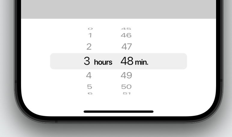
An iOS-style countdown timer picker.
A widget that uses a delegate to size and position multiple children.
A widget that provides a canvas on which to draw during the paint phase.
A ScrollView that creates custom scroll effects using slivers.
A widget that defers the layout of its single child to a delegate.
Data tables display sets of raw data. They usually appear in desktop enterprise products. The DataTable widget implements this component.
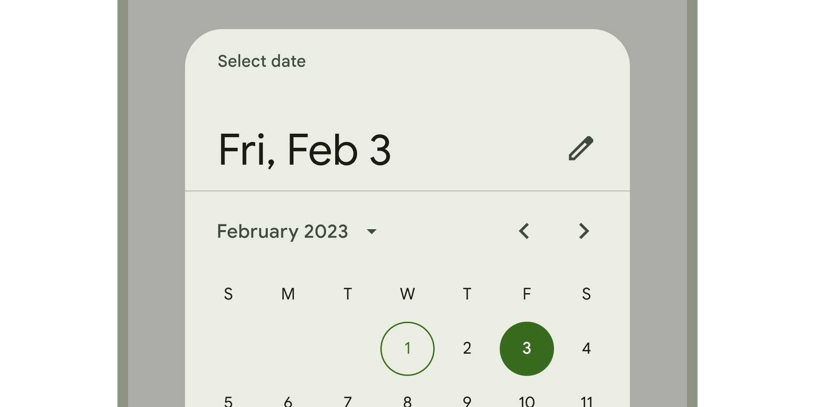
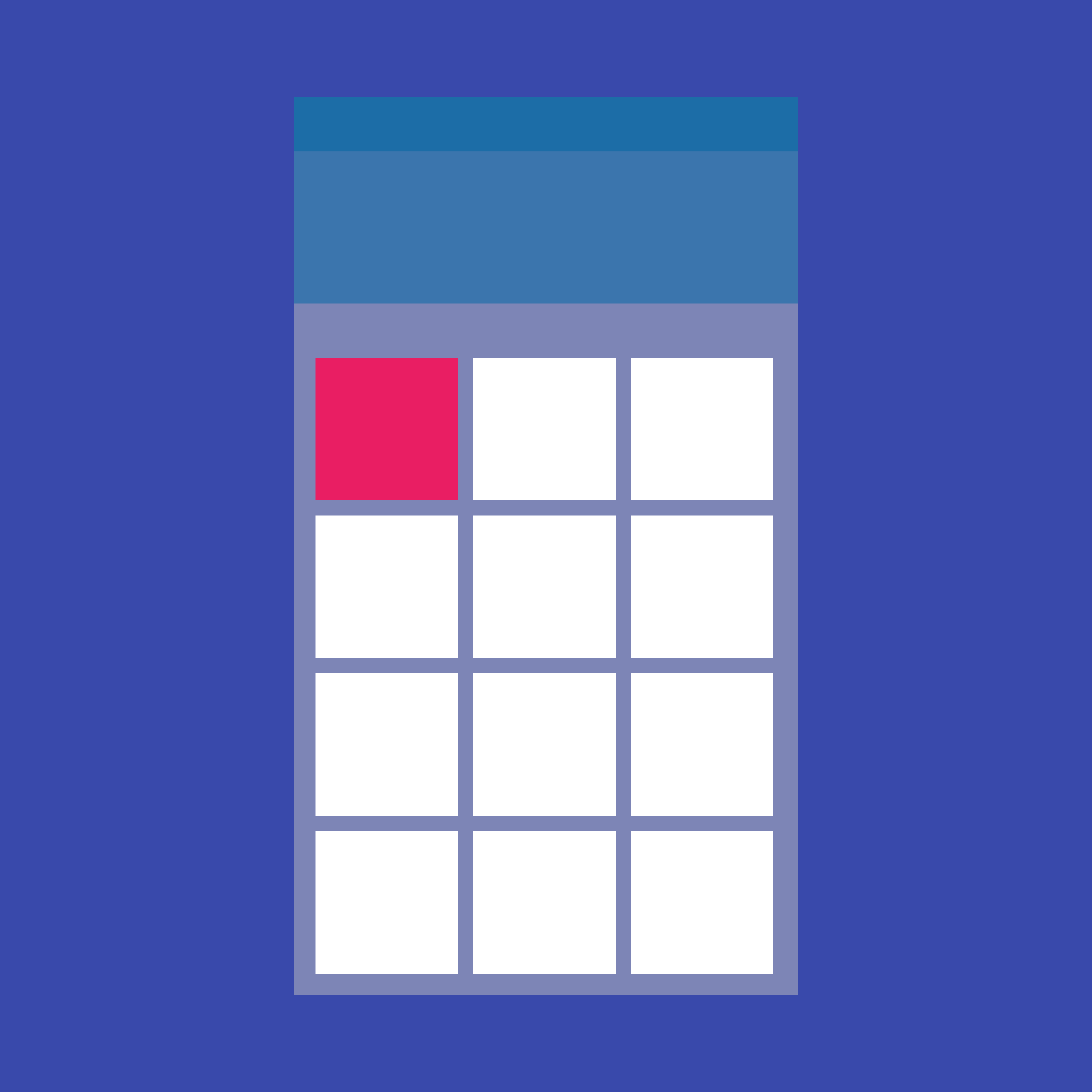
Calendar interface used to select a date or a range of dates.
A widget that paints a Decoration either before or after its child paints.
Animated version of a DecoratedBox that animates the different properties of its Decoration.
The text style to apply to descendant Text widgets without explicit style.
Animated version of a DefaultTextStyle that animates the different properties of its TextStyle.
A widget that can be dismissed by dragging in the indicated direction. Dragging or flinging this widget in the DismissDirection causes the child to slide...
Thin line that groups content in lists and containers.
A widget that receives data when a Draggable widget is dropped. When a draggable is dragged on top of a drag target, the drag target...
A widget that can be dragged from to a DragTarget. When a draggable widget recognizes the start of a drag gesture, it displays a feedback...
A container for a Scrollable that responds to drag gestures by resizing the scrollable until a limit is reached, and then scrolling.
A Material Design panel that slides in horizontally from the edge of a Scaffold to show navigation links in an application.
Shows the currently selected item and an arrow that opens a menu for selecting another item.
A Material Design elevated button. A filled button whose material elevates when pressed.
A widget that drops all the semantics of its descendants. This can be used to hide subwidgets that would otherwise be reported but that would...
A widget that expands a child of a Row, Column, or Flex.
Expansion panels contain creation flows and allow lightweight editing of an element. The ExpansionPanel widget implements this component.
Clickable block that triggers an action. These wider blocks can fit a text label and provide a larger target area.
Animates the opacity of a widget.
Scales and positions its child within itself according to fit.
Clickable block containing an icon that keeps a key action always in reach.
A widget that implements the flow layout algorithm.
The Flutter logo, in widget form. This widget respects the IconTheme.
An optional container for grouping together multiple form field widgets (e.g. TextField widgets).
A single form field. This widget maintains the current state of the form field, so that updates and validation errors are visually reflected in the...
A widget that applies a translation expressed as a fraction of the box's size before painting its child.
A widget that sizes its child to a fraction of the total available space. For more details about the layout algorithm, see RenderFractionallySizedOverflowBox.
Widget that builds itself based on the latest snapshot of interaction with a Future.
A widget that detects gestures. Attempts to recognize gestures that correspond to its non-null callbacks. If this widget has a child, it defers to that...
A grid list consists of a repeated pattern of cells arrayed in a vertical and horizontal layout. The GridView widget implements this component.
A widget that marks its child as being a candidate for hero animations.
A Material Design icon.
Clickable icons to prompt app users to take supplementary actions.
A widget that is invisible during hit testing. When ignoring is true, this widget (and its subtree) is invisible to hit testing. It still consumes...
A widget that displays an image.
An abstract class for building widgets that animate changes to their properties.
A Stack that shows a single child from a list of children.
A widget that enables pan and zoom interactions with its child.
A widget that sizes its child to the child's intrinsic height.
A widget that sizes its child to the child's intrinsic width.
A widget that calls a callback whenever the user presses or releases a key on a keyboard.
Builds a widget tree that can depend on the parent widget's size.
A box that limits its size only when it's unconstrained.
Vertical line that changes color as an ongoing process, such as loading an app or submitting a form, completes.
A widget that arranges its children sequentially along a given axis, forcing them to the dimension of the parent in the other axis.
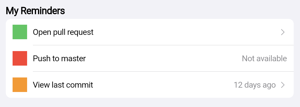
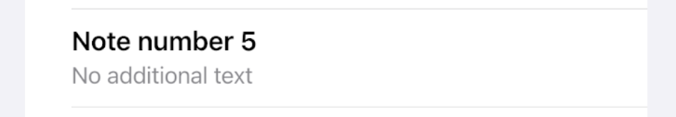
A single fixed-height row that typically contains some text as well as a leading or trailing icon.
A scrollable, linear list of widgets. ListView is the most commonly used scrolling widget. It displays its children one after another in the scroll direction....
Makes its child draggable starting from long press.
A convenience widget that wraps a number of widgets that are commonly required for applications implementing Material Design.
Animates the Matrix4 of a transformed widget.
Establishes a subtree in which media queries resolve to the given data.
Container that displays a list of choices on a temporary surface.
A widget that merges the semantics of its descendants.
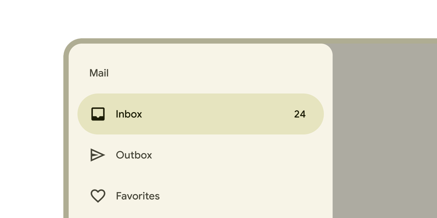
Persistent container on the leading edge of tablet and desktop screens to navigate to parts of an app.
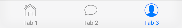
Persistent container that enables switching between primary destinations in an app.
Container that slides from the leading edge of the app to navigate to other sections in an app.
A widget that manages a set of child widgets with a stack discipline. Many apps have a navigator near the top of their widget hierarchy...
A scrolling view inside of which can be nested other scrolling views, with their scroll positions being intrinsically linked.
A widget that listens for Notifications bubbling up the tree.
A widget that lays the child out as if it was in the tree, but without painting anything, without making the child available for hit...
A widget that makes its child partially transparent.
A Material Design outlined button, essentially a TextButton with an outlined border.
A widget that lays out its children in a row unless they "overflow" the available horizontal space, in which case it lays them out in...
A widget that imposes different constraints on its child than it gets from its parent, possibly allowing the child to overflow the parent.
A widget that insets its child by the given padding.
A scrollable list that works page by page.
A widget that draws a box that represents where other widgets will one day be added.
Displays a menu when pressed and calls onSelected when the menu is dismissed because an item was selected.
Animated version of Positioned which takes a specific Animation to transition the child's position from a start position to and end position over the lifetime...
Form control that app users can set or clear to select only one option from a set.
A widget that displays a dart:ui.Image directly.
A Material Design pull-to-refresh wrapper for scrollables.
Animated version of Positioned which transitions the child's position based on the value of rect relative to a bounding box with the specified size.
A list whose items the user can interactively reorder by dragging.
A widget that animates an Animatable value and repeats indefinitely.
The RichText widget displays text that uses multiple different styles. The text to display is described using a tree of TextSpan objects, each of which...
A widget that rotates its child by a integral number of quarter turns.
Animates the rotation of a widget.
Layout a list of child widgets in the horizontal direction.
Implements the basic Material Design visual layout structure. This class provides APIs for showing drawers, snack bars, and bottom sheets.
Animates the scale of transformed widget.
Controls how Scrollable widgets behave in a subtree.
Scrollable implements the interaction model for a scrollable widget, including gesture recognition, but does not have an opinion about how the viewport, which actually displays...
A Material Design scrollbar. A scrollbar indicates which portion of a Scrollable widget is actually visible.
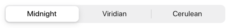
Single or multiple selected clickable blocks to help people select options, switch views, or sort elements.
A widget that annotates the widget tree with a description of the meaning of the widgets. Used by accessibility tools, search engines, and other semantic...
Simple dialogs can provide additional details or actions about a list item. For example they can display avatars icons clarifying subtext or orthogonal actions (such...
A box in which a single widget can be scrolled. This widget is useful when you have a single box that will normally be entirely...
Animates its own size and clips and aligns the child.
A box with a specified size. If given a child, this widget forces its child to have a specific width and/or height (assuming values are...
A widget that is a specific size but passes its original constraints through to its child, which will probably overflow.
Animates the position of a widget relative to its normal position.
Form control that enables selecting a range of values.
A material design app bar that integrates with a CustomScrollView.
A delegate that supplies children for slivers using a builder callback.
A delegate that supplies children for slivers using an explicit list.
Animates the opacity of a sliver widget.
A sliver that contains a single box child that fills the remaining space in the viewport.
A sliver that places multiple box children with the same main axis extent in a linear array.
A sliver that places multiple box children in a two dimensional arrangement.
A sliver that places multiple box children in a linear array along the main axis.
A sliver that applies padding on each side of another sliver.
A sliver whose size varies when the sliver is scrolled to the edge of the viewport opposite the sliver's GrowthDirection.
A sliver that contains a single box widget.
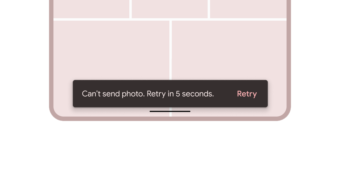
Brief messages about app processes that display at the bottom of the screen.
This class is useful if you want to overlap several children in a simple way, for example having some text and an image, overlaid with...
A Material Design stepper widget that displays progress through a sequence of steps.
Widget that builds itself based on the latest snapshot of interaction with a Stream.
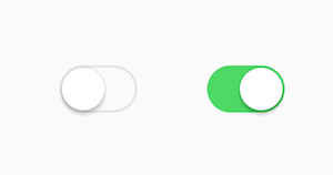
Toggle control that changes the state of a single item to on or off.
Layered containers that organize content across different screens, data sets, and other interactions.
A page view that displays the widget which corresponds to the currently selected tab. Typically used in conjunction with a TabBar.
Coordinates tab selection between a TabBar and a TabBarView.
Displays a row of small circular indicators, one per tab. The selected tab's indicator is highlighted. Often used in conjunction with a TabBarView.
Displays child widgets in rows and columns.
A run of text with a single style.
A Material Design text button. A simple flat button without a border outline.
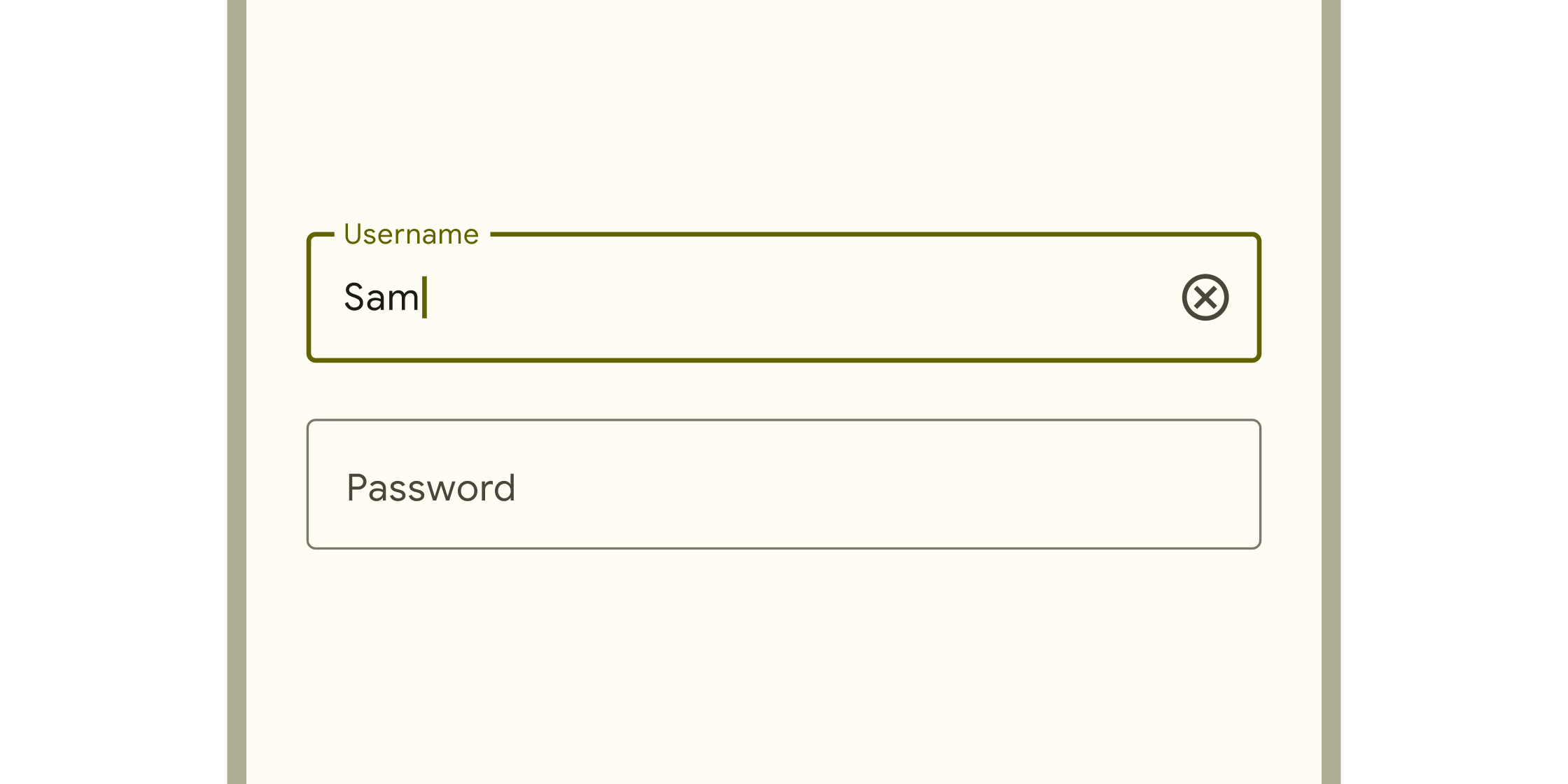
Box into which app users can enter text. They appear in forms and dialogs.
Applies a theme to descendant widgets. A theme describes the colors and typographic choices of an application.
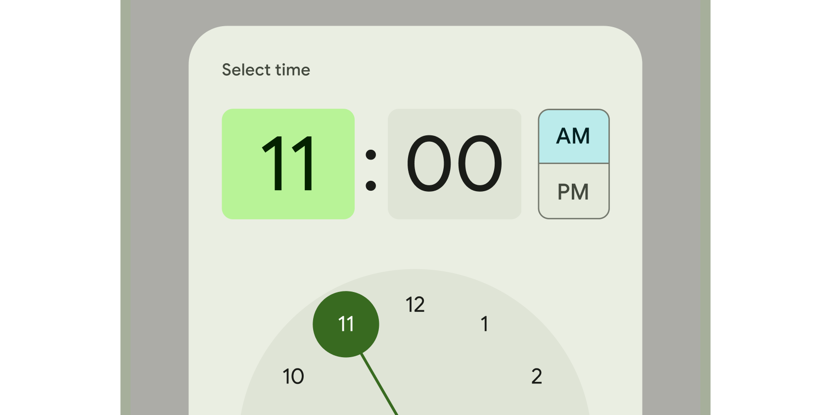
Clock interface used to select and set a specific time.
Tooltips provide text labels that help explain the function of a button or other user interface action. Wrap the button in a Tooltip widget to...
A widget that applies a transformation before painting its child.
A convenience class that wraps a number of widgets that are commonly required for an application.
A widget that displays its children in multiple horizontal or vertical runs.
Unless stated otherwise, the documentation on this site reflects Flutter 3.44.0. Page last updated on 2026-06-14. View source or report an issue.